My approach to patient flow involves (a) working out what the bed occupancy levels need to be in each of the downstream specialties of an acute hospital, then (b) working out what each specialty's average length of stay needs to be in order for those levels of bed occupancy to be achieved. For reasons too long-winded to go into here, I often want to visualize the variation in mean length of stay between different consultants in the same specialty.
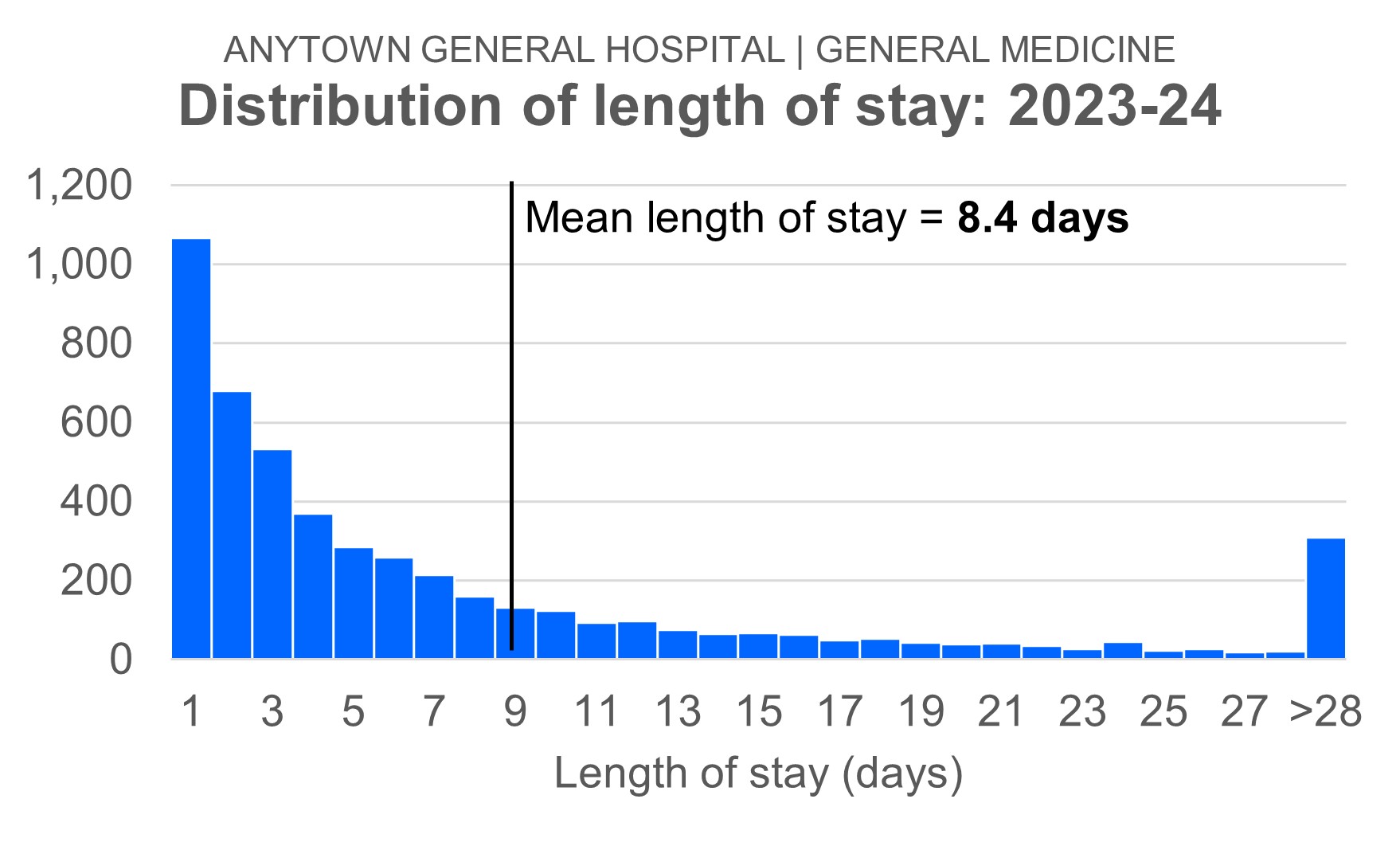
But there are two complications. Firstly, length of stay in the downstream specialties is not Normally distributed. The chart below shows the length of stay distribution for General Medicine, the specialty we'll be using as an example.
So if I want to compare each consultant's mean length of stay with the overall specialty mean length of stay, then I'll run into difficulties.
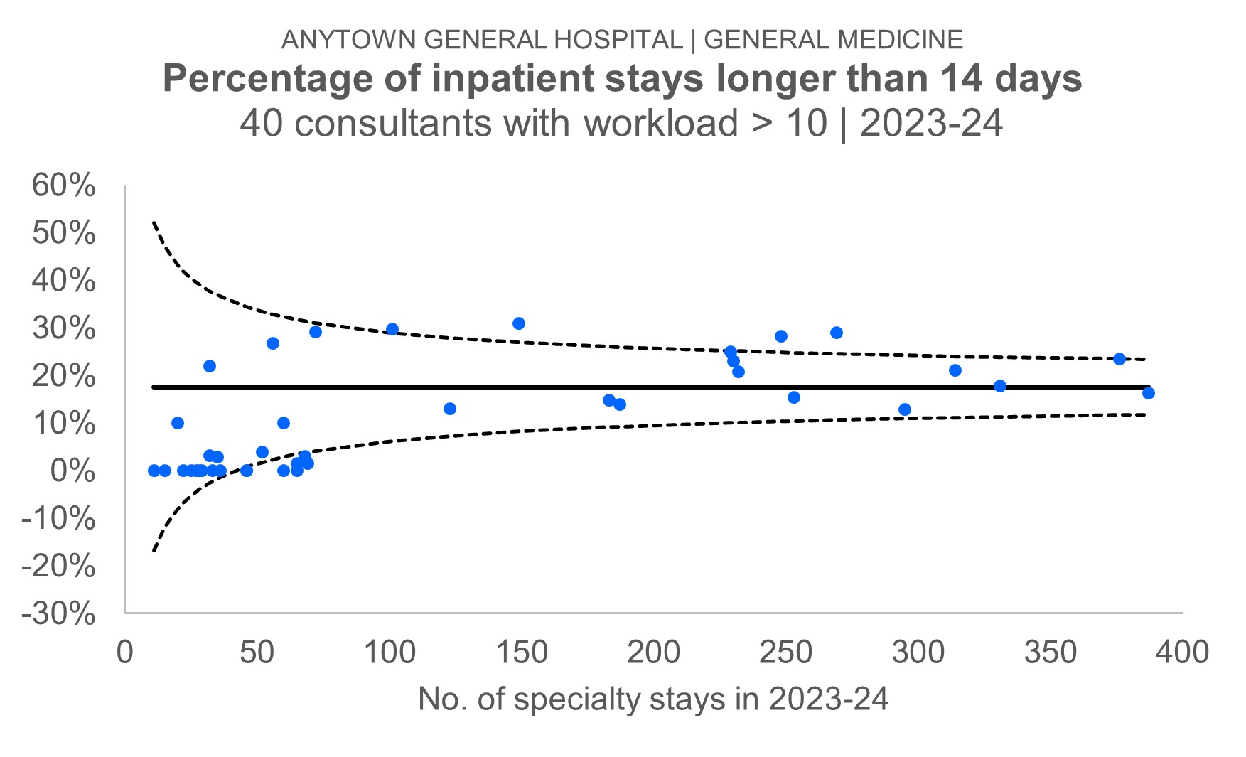
The second complication is that I want to present the data in a 'non-confrontational' way. I want to say to the consultants: "Here is the extent of the variation. And here are the consultants whose mean length of stay is statistically significantly higher or lower than the overall average." But I don't want to do it in a 'finger-pointing blame-game' way.
The solution to the second of these complications is to visualize the data as a funnel plot. The eminent British statistician David Spiegelhalter once wrote that funnel plots "avoid spurious ranking of institutions into 'league tables'". And it's precisely that 'spurious ranking' that I want to avoid.
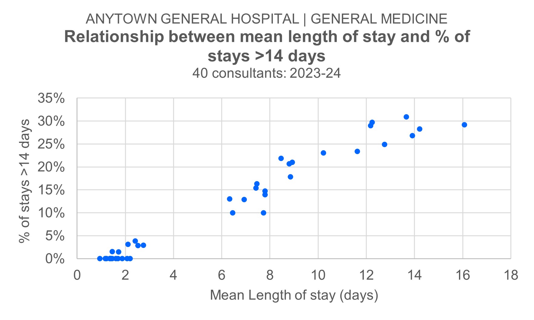
The solution to the first complication is a bit trickier. I've opted for a bit of cop-out! I found a non-parametric measure of length of stay (the proportion of stays longer than 14 days) instead of mean length of stay. I tried a few different length of stay 'cut-off points' (>7 days, >14 days, >21 days, >28 days), and it was the >14-days measure that correlated most closely (r = 0.98) to mean length of stay. I've shown the scatterplot of this relationship below:
If you download this Excel workbook—data_funnel_plot.xlsx (44 KB)—you can follow the steps as we go...
Step 1
We start with the summary table. I've listed—anonymously—40 consultant physicians to whom General Medicine stays were attributed in 2023-24. I'm only including the part of the stay after the Acute Medical Unit (AMU) stay in this. And I have excluded those consultants who had fewer than 10 stays attributed to them. I've used the consultant at the time the stay ended as my criterion for which consultant to use. Column B shows how many stays, and column C shows the number of those stays that were longer than 14 days.
Step 2
Now let's convert the counts in column C to proportions in column D. It's just the number of stays with a length of stay longer than 14 days (column C) divided by the total number of stays for each consultant (column B). It helps—for the purposes of intelligibility—to format these proportions as percentages. But it's worth remembering that the underlying numbers in column D are still proportions. These 40 proportions will be the 40 blue dots in the final funnel plot. Don't forget to work out the proportion for all consultants added together. We'll need this (it's the value in cell D43) in the next step.
Step 3
Next let's take that overall value in cell D43 and populate cells E2:E41 with it. This is the overall—all consultants—proportion of stays with a LoS longer than 14 days. We need this overall value to be 'repeated' for all of the consultants, so that it can become the solid black horizontal line that goes through the middle of the funnel plot.
Step 4
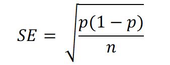
We now need to calculate—in column F—the relevant standard error values for each consultant. We use the textbook formula for the standard error of a proportion:
Step 5
Everything is now in place for us to calculate the lower and upper control limits. The Statistical Process Control (SPC) convention is to position the limits three standard errors (3SE) below and above the horizontal—overall proportion—line. So the calculations in columns G and H observe that convention. The lower control limits are 3SE below the overall proportion of 0.176; the upper control limits are 3SE above the overall proportion of 0.176.
Step 6
The final step—as far as the summary table data is concerned—is to re-order the data. It needs to be sorted by the values in column B: the workload figures. And thy need to be sorted in ascending order, with the consultant with the smallest workload at the top. If you don't do this, you'll end up with weird-looking control limits.
Step 7
Step 7 is where we draw the actual chart. I draw funnel plots as scatterplots. Highlight the non-contiguous cell ranges B1:B41, D1:E41 and G1:H41. If you then choose a basic bog-standard scatterplot (dots but no lines) from the menu, Excel will assume&mdashcorrectly—that the first series you specified (B1:B41) will be the x-values for all the data series, and the other four ranges (in columns D, E, G and H) will be the y-values. The formatting is faitrly obvious. Most of the markers will need to be converted into lines with no markers. But the series containing the individual consultant proportions should remain as just dots.
[4 September 2024]