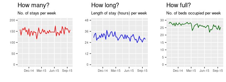
If I were a clinical director in an acute hospital, I would postively insist on seeing activity data like this updated every week. Three charts, side by side: the 'starter-for-ten' platform for assessing how well—or how badly—patients are flowing through my directorate.

One or two complications need to be overcome before we can be sure that this dashboard is genuinely useful. For one thing, if we want the reassurance that the arithmetic between the three graphs (red multiplied by blue equals green) has integrity, then we need to make sure we're measuring in-frame discharges each week and in-frame length of stay each week (more details on that here).
Secondly, we need to think about adding some specification limits to these graphs so that managers and clinicians can see the zone within which the green fullness values are supposed to fit.
But this is the foundation, the platform, the starting-point.
[11 November 2024]