A common mistake made by NHS managers when they look at performance metrics is to look at the data out of context. They might see that this week's number is lower than last week's number and conclude that things are getting worse. The mistake is that they've only looked at two numbers. They need more context.
A crude comparison of just two numbers will fail to take account of any longer-term variation in the process. It's possible for this week's number to be lower than last week's even though the long-term trend is upwards.
It's also possible for this week's number to be lower than last week's and for it to not mean anything at all. The variation between the two numbers could just be 'normal variation'. Noise, rather than signal.
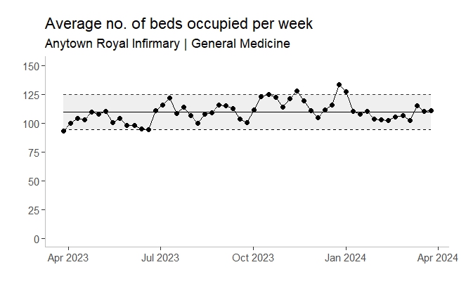
One way of addressing these two problems is to adopt a statistical process control (SPC) approach. The NHS has made a big move in this direction over the last 15-20 years. Control charts in particular have become a familiar feature of management information reports.
But although control charts solve both the context problem and the signal/noise problem, they bring a new problem to the table. A problem that can be just as damaging as the original two problems. This new problem is the visual metaphor that gives control charts their resonance and appeal.
A control chart's visual metaphor is containment. It is all about the question: "Is the jagged line contained within the tramlines?"
And then—whether we like it or not—we get the complacency associated with an affirmative answer to that question. If the jagged line is contained within the tramlines, then all must be well. The process must be 'in control'.
Lots of managers, who've only been exposed to a brief—now half-remembered—explanation of control charts, assume that the SPC black box has somehow worked out what the indicator ought to be, as opposed to what is it actually is. Managers will assume that the tramlines—the control limits—contain the zone of 'ought-to-be'-ness, which will lead them to a diagnosis of 'all is well'. But that conclusion can be a complacent and incorrect one. And the onus is on data analysts to put them right.
The first thing we need to do when presenting a control chart is to always make it clear that the control limits are calculated from the data itself. There is no external 'ought-to-be' metric in play. A control chart is the voice of the process pure and simple. We need to keep saying that over and over again: the voice of the process. If the data points themselves exhibit a lot of variation then the gap between the control limits will be wide; if the data points exhibit less variation, the gap between the control limits will be narrow. And that's it. But the positioning of the control limits is decided purely by the data. There is no external judgement.
Secondly, we need to concede that the control chart's visual metaphor can be potentially misleading. Yes, we should say, the tramlines—and the fact of the jagged line being contained within those tramlines—do suggest very strongly that everything is OK. But control charts are designed for processes that are already mainly stable and already close to functional. They're not great for describing processes that are unstable and dysfunctional.
Thirdly, if the process we're measuring and describing is unstable and/or dysfunctional, then we should consider drawing specification limits instead of control limits. Specification limits are the voice of the consumer instead of the voice of the process. Specification limits are an external imposition and they are therefore a better representation of what 'ought to be'. Doing this will mean that our control chart is no longer a conventional control chart, so there's a comfort zone that needs to be stepped out of here. And it's also the case that when we consult the textbooks and websites we'll be warned off specification limits. But consider this comment from one such website: "The only good use of specification limits on a control chart that I've seen is to make a point when the process is operating nowhere near the specifications."
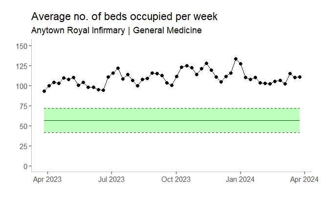
Now I'm a long way away from being able to calculate specification limits 'by the book'. I'm still very much at the stage where I feel slightly intimidated by the Cp and Cpk constants! But if I can get them right, they'll paint a much clearer picture, and they'll make the visual metaphor of containment much more relevant to the problem at hand.
[14 February 2025]