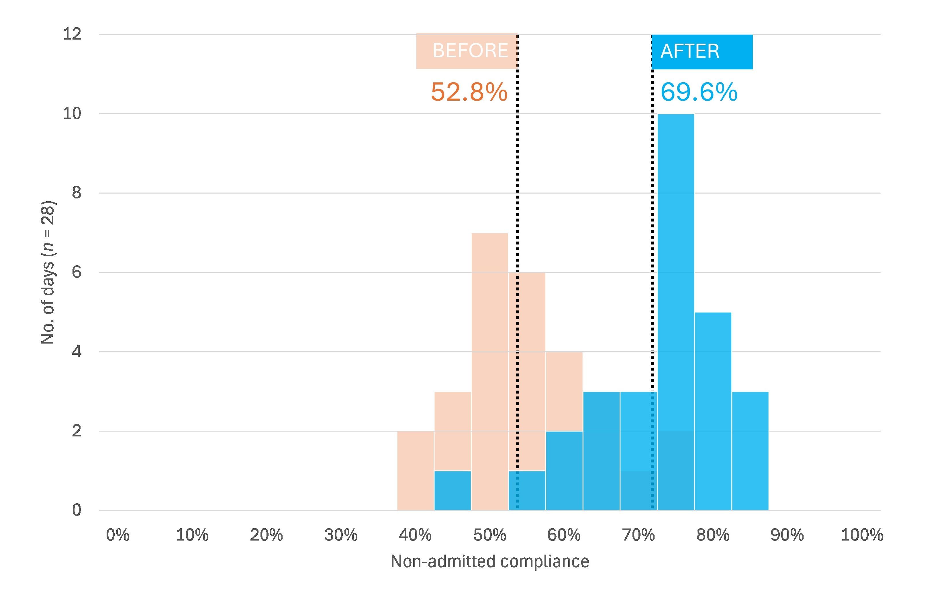
I'm getting increasingly drawn to the idea of using overlapping histograms as a way of showing how something is - or is not - differnet from another thing. On eof the classic uses of overlapping histograms (in the stats textbooks, at least!) is a distribution of adult female heights on the left and a distribution of adult male heights on the right.
What I've done here is I've tried to show how a change in practice in an A&E department led to a higher proportion of patients being treated in less than four hours. The virtue of the histogram approach is that you can still see the amount of variation, whilst also seeing the difference.

The trouble is, I cannot get a decent overlapping histogram effect in Microsoft Excel. The chart above is a weird, convoluted mash-up of Excel and PowerPoint, which took quite a few attempts before I got something that looked even remotely OK and even now still looks a bit rubbish. I think one of the issues is that there's an expectation that the overlapping area should be the colour you'd get when you actually mix the two colours.
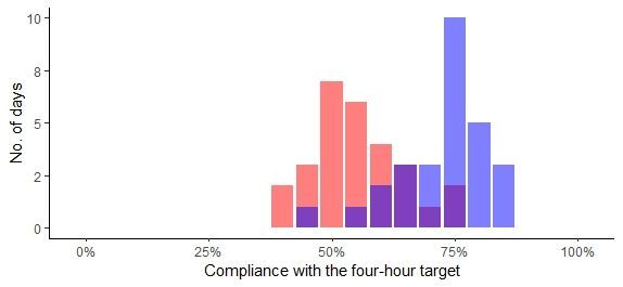
So I had another go but this time using R and {ggplot2}:

[25 October 2024]