There have been times when I've felt like I've been wading through treacle. Despite having devoted a decade-long chunk of my professional life to bringing data to bear on the patient flow problem, I often feel as I've been getting nowhere. For ten years, I've been trying to arrange graphs depicting different aspects of patient flow into some sort of order, and then presenting these ordered graphs as—hopefully—a connected-together argument. But I've obviously been doing something wrong, because nobody apart from me seems to be able to see how the connections between the graphs work!
But then—suddenly—just before six o' clock yesterday teatime, I had a 'light bulb' moment: I've been looking at it the wrong way all this time. Flow_ology isn't a series of graphs; it's a series of meetings.
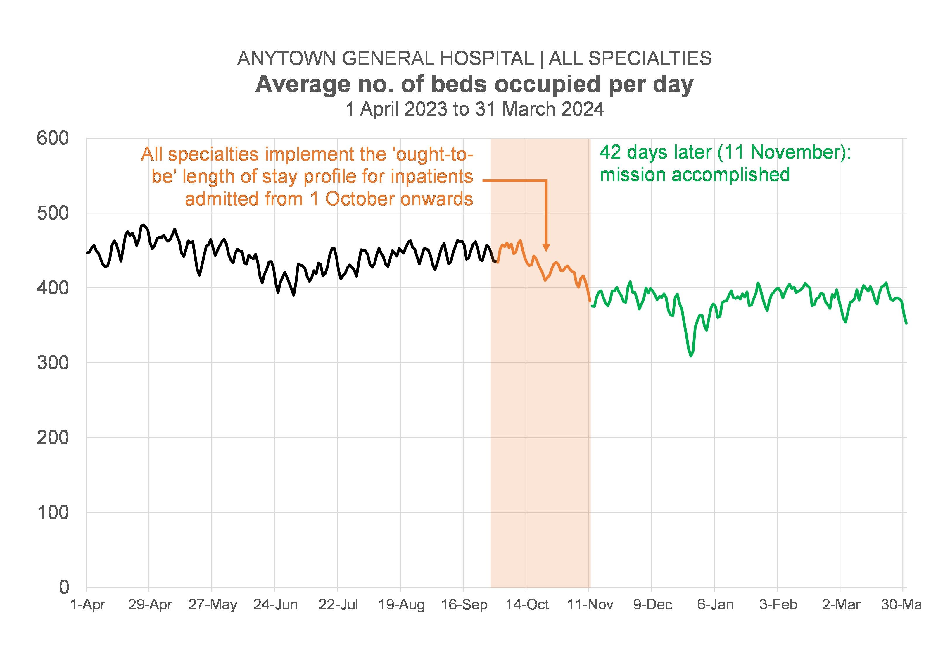
Let me backtrack for a moment. Over the last two or three months, I've been attending—and presenting data at—quite a lot of meetings. Probably more than 20 meetings altogether. As a result, I've been a lot more 'up close and personal' than usual with how clinical directors, clinical nurse managers, charge nurses, service managers and hospital managers react when I show them datagraphics that are basically saying: "If the downstream specialties in this hospital can find a way of reducing their bed occupancy (I've worked out the precise levels they need to reduce their occupancy to: we haven't just left it as a vague aspirational "We need our beds to be less full"!).
And I've been pleasantly surprised by how positively my data messages appear to have been received. I'd expected hostility; what I got was agreement, a collaborative mood, a sense of shared endeavour.
These meetings I've been going to, there's been a pattern to them. Firstly, at the start of the process, in early May, there were some informal exploratory meetings with senior organization-wide decision-makers that tested the 'underpinning theory' (which I sometimes pompously refer to as 'the fullness hypothesis'). We wanted to check that our hypothesis was sound before proceeding.
Secondly, there were two or three—more formal—meetings that were attended by members of the hospital management team (hospital manager, senior nurse, associate medical director, general manager). These meetings were basically about saying "We've got a method here: we can work out bed occupancy, length of stay and activity targets (we call them 'ought-to-be' numbers as opposed to 'targets' to make it sound a bit less 'top-down') for each inpatient specialty. Does this look like something you want to try out? Do we have your permission to take this further?"
And because the answer to that question was "Yes", we then moved to a third level of meetings where I—with the hospital manager by my side—have been introducing the specialties—one by one—to their 'ought-to-be' numbers. At these individual specialty meetings there have usually been about four or five other people in the room (the clinical director, the clinical nurse manager, the service manager, a pharmacist, one of the physios). And the objective at these meetings has been not just to introduce the specialties to their numbers, but also to make sure that—at specialty level, where things get a lot more granular—the data still holds up. After all, data issues that are almost impossible to detect at the 'whole hospital' level can be a lot more visible at the directorate, specialty level.
But this third level of meetings is where I'm sensing a frustration. It feels as if we've come up against an impasse. In a way, we were doing these meetings as if securing agreement to the numbers was the only objective. And—in the main—it's been "Mission accomplished" on that front. Even better than "Mission Accomplished", in fact, because it's always been the case that each of these meetings has thrown up a host of ideas and initiatives that might help in the quest for either fewer admissions or shorter length of stay or both.
No, the problem is that we should've been clearer about a secondary objective for these meetings. We should have been aiming—at these third-level meetings—to move to a fourth level of meetings. This fourth level would be the level where we talk to all the actual clinicians (the 'ordinary' clinicians, not just the 'clinical director-type' clinicians) who make actual day-to-day decisions about which patients get admitted, which patients don't get admitted, and how long those patients stay in hospital before they get discharged.
But we haven't done that. So it feels to me as if the next step has been left unaddressed.
Yet, if I'm right—if my hunch about this is right—then the next level—the fourth level—of meetings is the most important level. It's the level where—if there is to be action—the action will happen.
So why is this revelatory for me? Why was it a 'lightbulb' moment yesterday teatime?
Flow_ology—which is basically the name I give to the set of data visualizations that I think an organization needs to look at if it wants to improve its patient flow—isn't a set of data visualizations at all. It's a series of meetings. It's a process. It's a mechanism for navigating through the decision-levels, securing agreement and permission along the way, until we get to the fourth—coalface—level. Flow_ology isn't data visualization; it's project management done through a series of meetings. It matters more that the meetings are in the right order than that the graphs are in the right order (though that matters, too, obviously!).
But my lightbulb moment also felt revelatory because I wondered how many data analysts working in healthcare think of their core end-product as attending meetings and presenting data at meetings? Yes, some of us do, but—in my view—not enough of us do. And it's not just what we as data analysts think. When decision-makers think about what 'data' looks like, they probably think of tables and charts on screens and dashboards. Excel spreadsheets attached to emails. They probably don't immediately think of data as something that gets presented to decision-makers at meetings. Yet if we number-crunchers are serious as a profession about data-driven decision-making, then we have to wise up to the idea that decisions happen mainly at meetings and we need to be attending those meetings to both present the data and answer any questions thrown up by the data.
[23 August 2024]