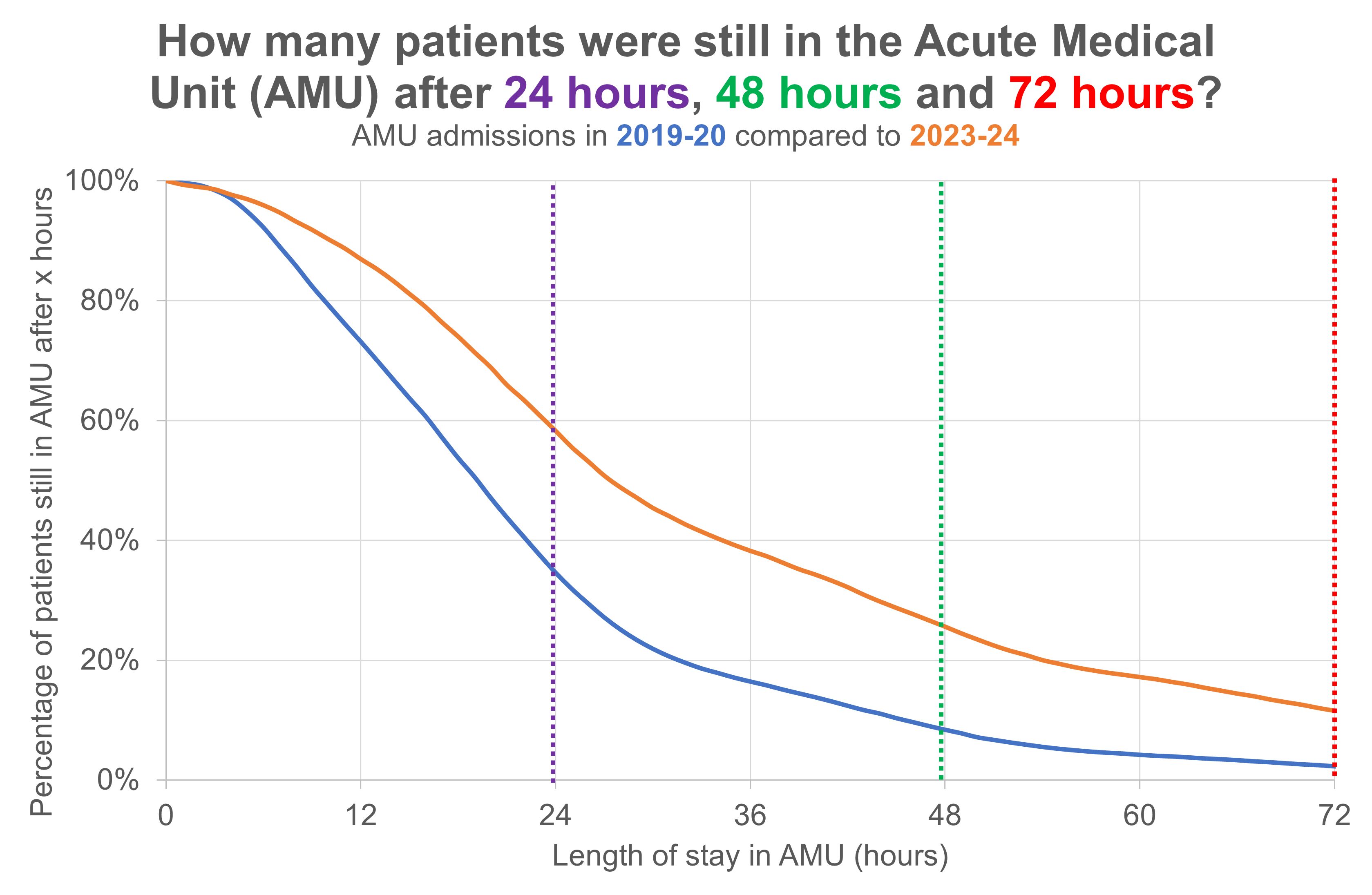
I like the idea of taking a data visualization from one discipline and applying it to another. Kaplan-Meier curves are often used for visualizing survival following the diagnosis of a serious illness, but I think they can also work for visualizing length of stay. I've been trying to use Kaplan-Meier curves to compare two length of stay distributions, but I worry that they're just not 'intuitive' enough. Or that I'll never be able to rid them of the 'mortality' baggage they carry.

I like how Kaplan-Meier curves convert a length of stay distribution into a 'cohort trajectory'. I think people working in healthcare have a fondness for trajectories, so there may be life in this idea yet. Once you've got the hang of it, this chart shows not only that admissions to the AMU stayed longer in 2023-24 than they did four years earlier in 2019-20, but also that 2023-24's longer stays didn't kick in until after four hours. Also we can see that by the time the gap between the years had fully opened up (by the 24-hour mark), the gap stayed wide and only started to narrow after about 48-60 hours.
But what I like most about the Kaplan-Meier visualization technique is that it allows us to compare two distributions within one chart. It's very hard to compare two distributions when they're visualized as histograms, but when we show the distributions as—in effect—reverse cumulative polygons then we can have several trajectories on the same chart and compare them more easily.
[8 November 2024]