I've been trying to understand how hospital ward fullness works, but in a bit more detail than before.
Specifically, I'm trying to work out how the fullness of a ward that is downstream of an Acute Medical Unit (AMU) can affect the flow of patients from that AMU.
Logic—and eyewitness evidence—suggests that when the downstream ward is full, then patients in the AMU who are ready to transfer to that ward will have to wait for a bed to become available before they can move. And so their length of stay in AMU will likely be longer as a result. Hence as well as trying to understand the fullness of the downstream ward, I'm also trying to understand how that fullness might in some way relate to the length of stay in AMU of the patients who end up being transferred to the downstream ward.
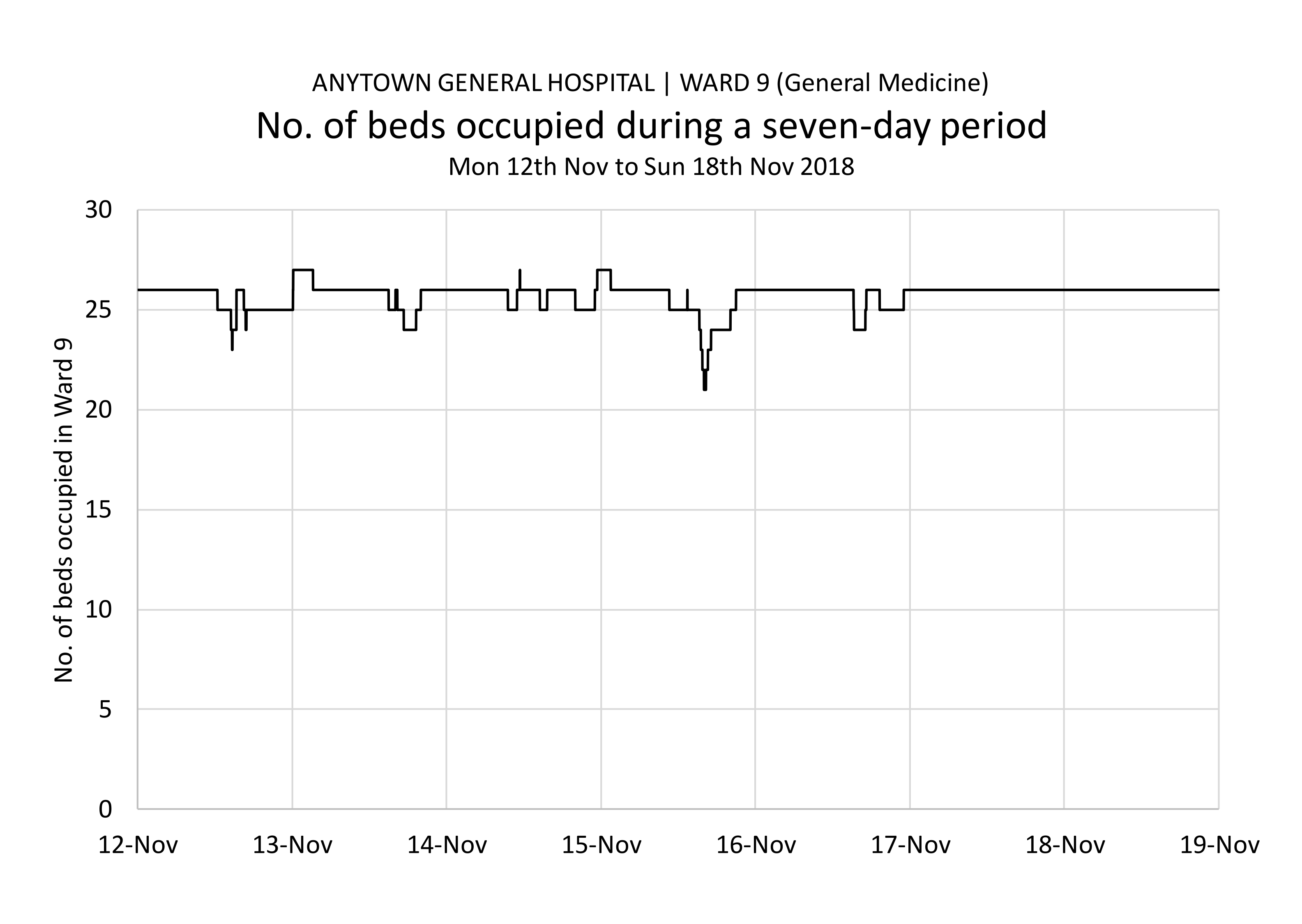
As an example, I decided to look at a week in the life of a downstream ward in an acute hospital. Let's call it Ward 9. It's a General Medicine ward, it's got 26 beds, and it's one of about 12 medical wards downstream of an AMU with 36 beds. The week in question is the week beginning Monday 12th November 2018 and I started by describing the fullness of the ward like this:
Leaving aside the annoying fact that we appear to have instances when there were 27 patients occupying beds in a ward that only has 26 beds (although in fairness it only appears to have happened three times, and we know that data quality is an issue when we look at data with such a strong magnifying glass, so I think we cna live with this for now), this is—I think— a pretty good way of showing how full of patients a 26-bed ward is over a four-week period.
But I am interested in how this fullness might have influenced the times at which patients from AMU arrived into this ward during the same period, so the next step was to somehow 'overlay' these arrivals from AMU onto this graph. I decided to show them as blue dots superimposed on the black fullness line:
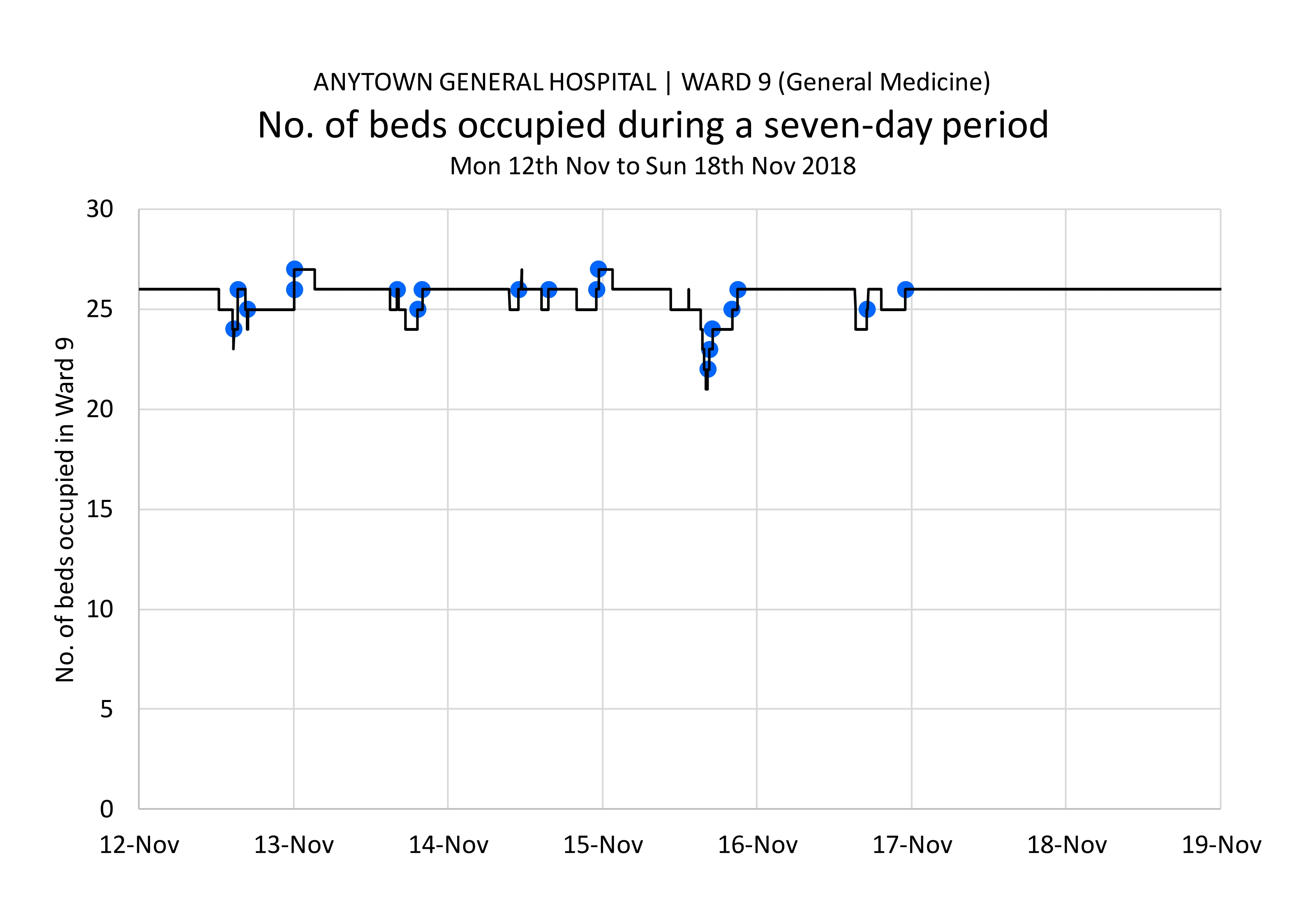
There were about 20 'moments' when patients from AMU were transferred into Ward 9. That's what the blue dots signify: the transfer moments. One of the things I'm wondering about is how often patients were transferred into a bed when that was the only bed available compared to how many times a transfer occurred when there was more than one empty bed. It's difficult to see from this grah. But it's a start!
But there is still something that isn't shown on this graph, and that is the length of time the patients spent in the AMU before they were transferred to Ward 9. So I re-visited the blue dots and decided to use the secondary y-axis to measure the AMU length of stay. And I used y-error bars to show the length of stay visually:
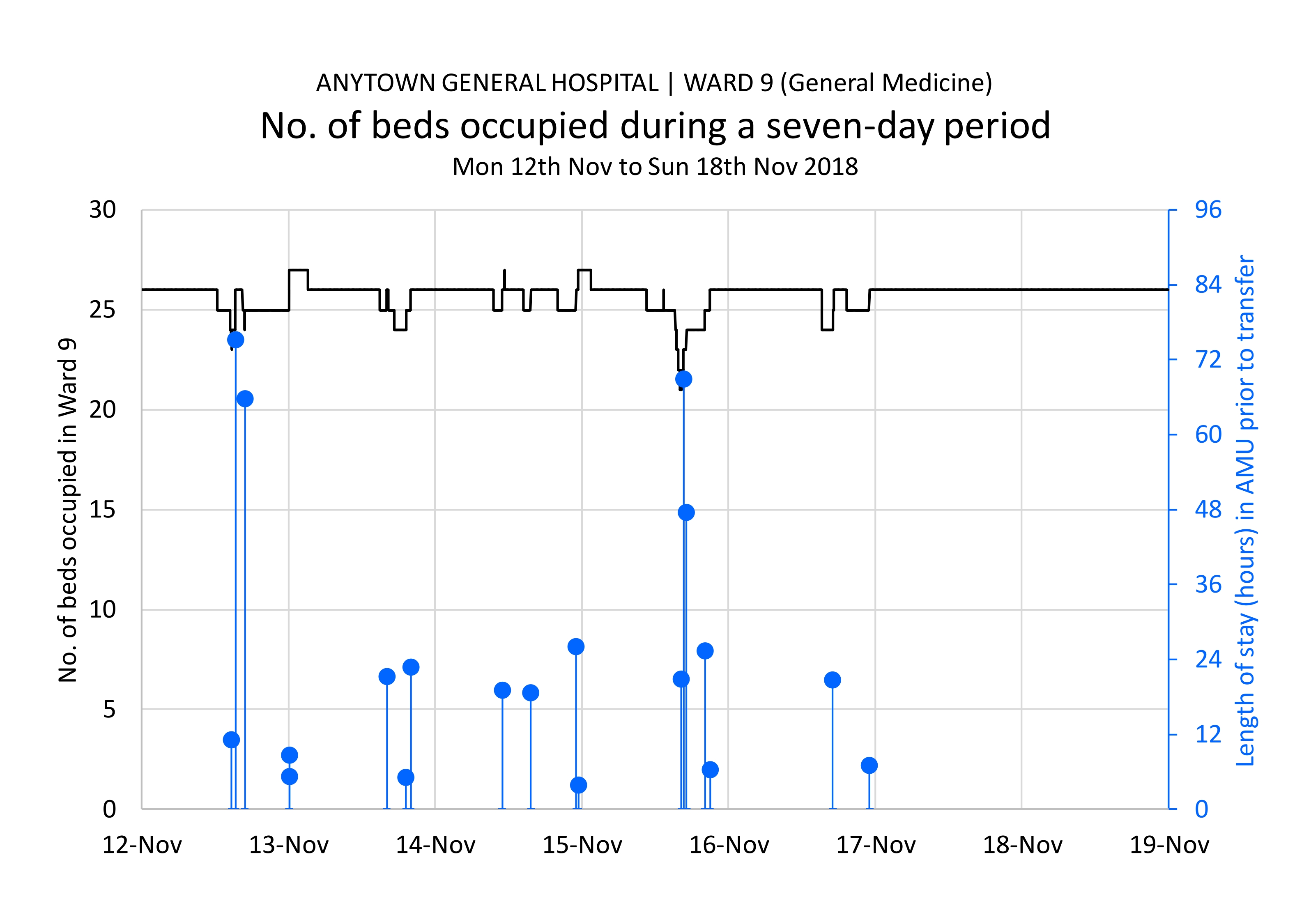
We now end up with 19 'furlong markers' of varying heights. The taller furlong markers are the patients who spent longer in AMU than the shorter ones did.
I've ended up with a visualization that I quite like: it kind of does what I set out to do, in that it shows the fullness in one place and juxtaposes that fullness with the length of stay that was experienced in another place, prior to transfer. And I think it is important that people be able to see these two things simultaneously, in teh same eye-sweep, so to speak.
But although I'm pleased with the design of the visualization, I'm less pleased with its explanatory power! I was hoping that the longer AMU stays would have correlated with long-ish periods of time preceding the transfer when the ward was full. And vice versa for the shorter AMU stays. But I don't think that's what I'm seeing here. So it's quite possibly a case of 'back to the drawing board'. But in the meantime, here's what I've done so far and if anyone has any ideas for how to change or develop this, then please get in touch!
[15 November 2019]