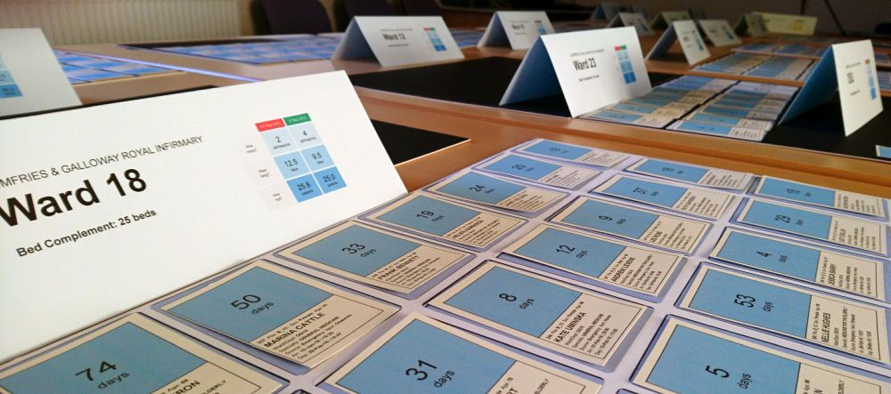
For a number of years during the Pre-Pandemic Era, I used to travel up and down the country facilitating a workshop called Flowopoly. Originally designed in collaboration with Michael Fox at the behest of the Scottish Government's Whole System Patient Flow Programme, Flowopoly was a very physical, very tactile, 'anti-digital' way of representing a hospital's patient flow using tables, boards and cards.
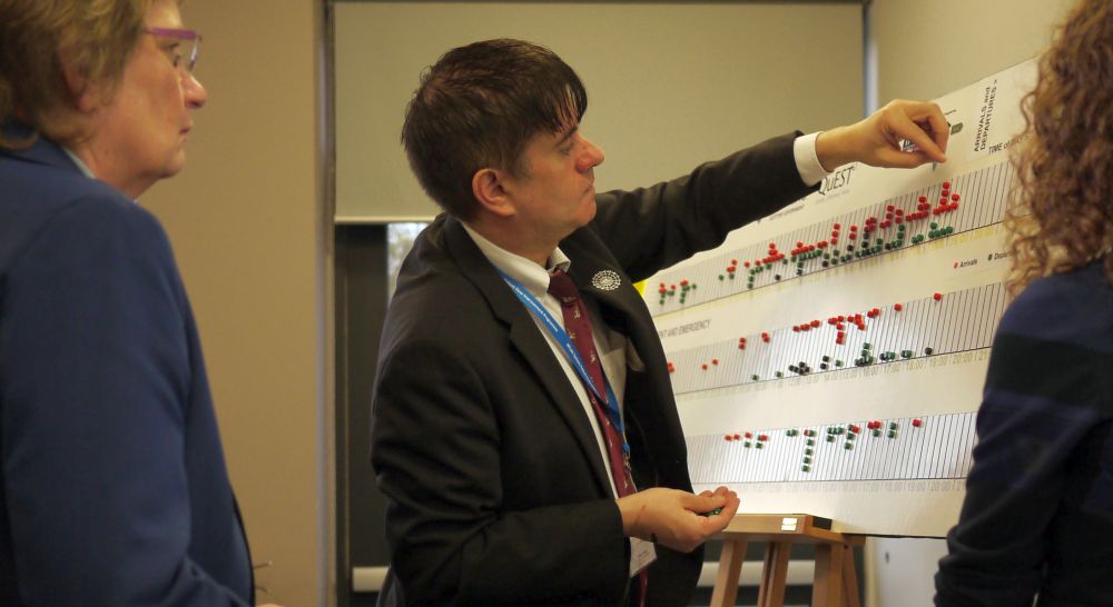
We'd use actual data from an actual hospital (taking care to anonymize the patient details) and we'd show what a 'typically bad' day looked like by looking at all of the patient movements that took place in a 24-hour period. Movements in, out of, and between the emergency department (ED), the admission wards and the downstream specialty wards. After a bit of experimentation, we'd worked out that it took—on average—seven seconds to call out and re-enact each patient move, so a day in the life of a medium-sized DGH might take about 90 minutes to replay.
But the exact length of a replay would depend on something else: we'd schedule three or four pauses during the replays, to allow time for discussion. We felt that it was important for comments and observations to be aired from the floor. Sometimes each discussion pause could last for as long as twenty minutes.
After the bad day replay, we'd then do a replay of a good day for the same hospital. We used compliance with the four-hour target as our criteria for defining what was 'good' or 'bad'. Back in the mid-late-2010s a bad day might have been 70% compliance, whereas a good day might have been 95% compliance.
There were three features of Flowopoly that struck a chord with participants. And I've recently learned to give each of these three features a posh, academic-sounding name, so let me just go through them, so that I can show off my newly-acquired academic knowledge!
Epistemological plurality
Flowopoly was a representation of patient flow that respected different ways of making sense of the world. I'm a data analyst so my default setting when it comes to making sense of the world is to use numbers, tables and graphs. But I was conscious that my audience (managers, nurses, AHPs, doctors) didn't all share my love of datagraphics. In fact, let's be honest here, a lot of people feel positively alienated by seeing their everyday clinical world represented by numbers. So I had to somehow represent the world in a different way, one that hopefully wasn't quite as alienating. Much to my surprise, tables, boards and cards seemed to do the trick.
Dyadic, generalized shared reality
I didn't know it at the time, but Flowopoly was an exercise in what psychologists call joint attention. The facilitator and the participants (who together make up the 'dryad') are all looking at the same thing (patient flow). But each of these participants would normally visualize patient flow in a different way. With Flowopoly we were trying to get a large-ish number (sometimes as many as 100) of people to look at the same thing in the same way. Trying to create a shared mental model (a "generalized shared reality") as a platform for coming up with possible solutions.
The power of spectacle
Flowopoly was a decidedly unorthodox way of looking at—and making sense of—the world. Its 'flamboyance' stayed in people's minds rather longer than—say—a PowerPoint presentation with loads of slides with graphs on them would have done.
But while there were these three genuinely innovative things going on with Flowopoly, these were counter-balanced by some problems, which I've had lots of time to reflect upon in the period since the pandemic. I'm going to focus here on what I think were the three biggest problems:
Unspoken truths
Flowopoly left too much unsaid. It was like when someone says "This chart speaks for itself" and the chart absolutely doesn't speak for itself. Except I was saying "This replay speaks for itself". And the replay didn't speak for itself, either. I'm pretty sure the only people who really got the message of the replays were the people who were already well-versed in how patient flow works: senior nurses, bed managers, service managers who'd got experience of working in multiple directorates. And yes, these experienced people did their best to guide the others through it during the discussion pauses. But—for the most part—people just witnessed chaos. There wasn't enough 'punditry'—not enough annotation—to help people make sense of the chaos.
The ED still dominated things
In its laudable attempt to show the whole system (and not just individual silos), Flowopoly left people with this feeling that yes, it is indeed a whole system problem, but this whole system is dominated by the ED. The ED would typically account for two-thirds of the patient moves in a Flowopoly replay, so it took up most of the time and generated most of the 'noise'. Now I know that the downstream wards occupied most of the space, but space wasn’t what got people’s attention. So if a big part of what I was trying to do with Flowopoly was to get people to focus on downstream parts of the system as well as upstream parts of the system, then it failed.
We just looked at the 'what is'; not the 'what ought to be'
Flowopoly concentrated entirely on what actually happened; there was no attempt to construct what-if scenarios. We didn't look at what patient flow would look like if we changed things. I mean, yes, we looked at a bad day and then we looked at a good day, and I did my best to ensure that I picked a typical bad day and a typical good day, and I did my best to try and get people to work out what it was about the good day that made patient flow better than it was on the bad day. But we didn't explicitly try to change reality.
I've now re-designed Flowopoly in an attempt to keep the good and fix the bad.
Flow moments and crime scene markers
Firstly, the annotation problem. We now have a lot more annotation, a lot more commentary, a lot more sensemaking. And I've been at pains to try and make this sense-making as interactive as possible. We draw attention to flow moments (the times when a patient moves from one staging post to another) by dropping numbered crime scene markers so that we can refer to them later in more detail. This allows us to more easily segue from the 'flow moment replay reality' to a more general point about flow.
Slower replays of the zoomed-in downstream
Secondly, the problem of too much attention on the front door has been addressed by making the centrepiece replays slower speed replays of one specific downstream area. Instead of 24 hours in the life of the whole hospital, where the downstream detail gets drowned out by the noise of the front door, we now have a more considered, slower approach to a downstream specialty. Two weeks in the life of a downstream specialty can be replayed in about 45 minutes. This allows us to look longer and closer at the parts of the whole system that we need to look at first.
What if..?
This zooming in to one of the downstream specialties also allows us to address the third shortcoming of Flowopoly: we now have time to properly address the what-if question. What if we found a way of reducing the length of stay in the specialty? Or what if we found a way of reducing the number of admissions to the specialty? Do either or both of those changes affect the fullness of the specialty? Does the fullness of the downstream affect the speed with which patients from the previous staging post move into the downstream specialty? Does the increased speed of those prior moves then alleviate the exit block experienced by the ED? Now—admittedly—we approach this what-if simulation in a very analogue way, but that's fine. The 'anti-digital' approach is one of Flowopoly's major selling points. The point is we are now—in Bruce Mau's famous phrase—"making hope visible".
Summary
So by moving towards a what-if scenario that shows how patient flow can be significantly improved, we also move to a point where we can see more clearly exactly what it is that we need to measure, describe and monitor in order to improve patient flow.
[6 August 2024]