We bang on about how we want 'data-driven decision-making' in healthcare, but the methods we use to communicate activity and performance data hinder decision-making because they treat decision-makers as passive consumers of data rather than as active co-designers of data.
If we want decision-making to be driven by data, we need to communicate data in a way that facilitates discussions that move things forward. Decision-makers need to be able to ask questions about the data, make suggestions about how the analysis can be refined, demand different visualizations. And this interactivity—this discussion element—won't be smooth and easy. It will involve debate, argument, and disagreement.
How have we got ourselves into a position where we're mainly publishing data to passive decision-makers? And can we somehow re-establish a degree of interactivity into the process?
First of all how did we get here?
Three things stand out for me.
Firstly, the last ten years or so have witnessed a boom in the use of dashboard-type software (e.g. Qlik, Tableau, Power BI) for communicating activity and performance data. And although some analytics staff do make a point of launching new dashboards by organizing meetings where the data can be introduced, explained and discussed, the predominant mode of publication is to simply push the data out there and hope that the passive decision-makers self-serve themselves to it.
Secondly, the same decade has also seen significant steps being made in the professionalisation of the healthcare analytics workforce. We've now got a much stronger emphasis on technical skills and—despite our best intentions—a correspondingly weaker emphasis on communications skills and organisational understanding ("domain knowledge").
And, thirdly, we've had the pandemic, which in early 2020 dealt a blow to any meeting room face-to-face interaction that was already taking place between analysts and decision-makers. Face-to-face has never really recovered from that blow. Working from home and Microsoft Teams have become the norm, and the opportunities for in-person meetings in which data gets discussed and debated in the service of actual decision-making have dwindled accordingly.
Why is this lack of face-to-face discussion and debate a problem?
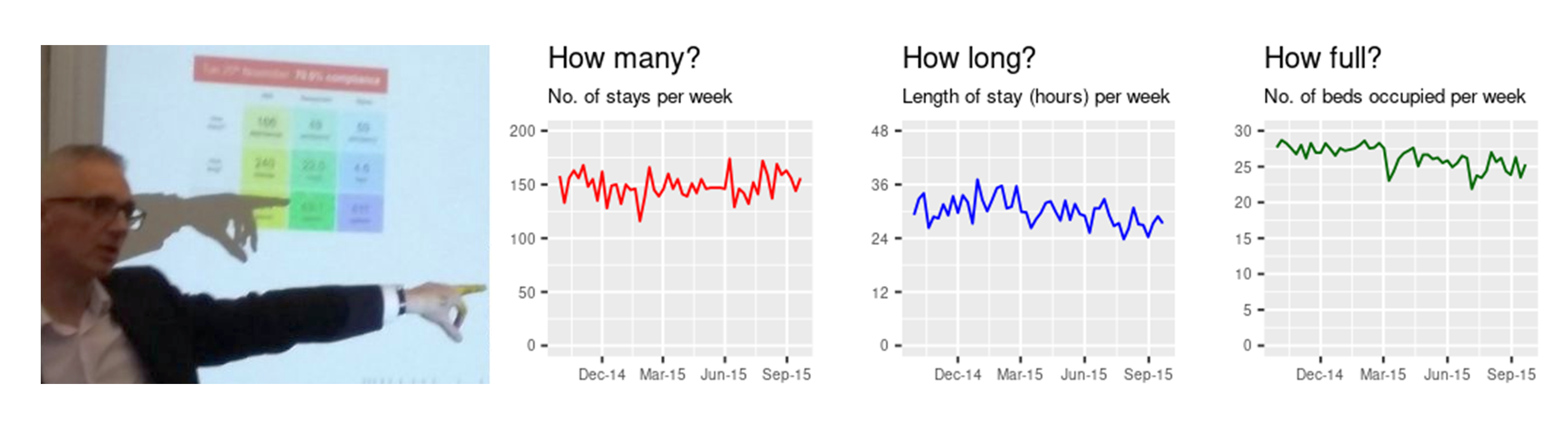
It's a problem because—in my experience—dashboard interfaces are not well-suited to discussion and debate. They're better suited to one solitary person looking at them on a screen. But NHS people don't make decisions on their own in front of a laptop or an iPhone screen; they make decisions collaboratively. In rooms. With other people. Arguing, discussing, developing. And yes, if we want data-driven decision-making, then the data needs to be in the room (along with an interpreter) at the same time.
Additionally, by recruiting and developing staff on the basis of technical skills (the 'Data Science Movement'), we've amplified the idea that data is mainly a technical skill (I mean, I know we always say that of course it's not just that, but let's be honest here, in reality the communications skills—the soft skills—take a back seat.) Analytics has become predominantly about the right query, the right code, the right visualization and bingo! Decision! Well, no, I don't think that's how it works; there's the discussion and debate that follow the presentation of the visualization, the consequent re-drafting of the query, the changes to the query parameters, the switch of visual metaphor once you've had the discussion and witnessed the misunderstanding that the first visual metaphor caused. To say nothing of all the discussion and clarification that has to happen in order to arrive at a query in the first place.
But those reasons are surface-level reasons. There's a deeper reason why it's a problem. We've lost sight of the fact that decision-making shouldn't just be data-driven; it should also be disagreement-driven. That centuries-old Hegelian dialectic of thesis > antithesis > synthesis is what moves us forward. If the thesis is the first-draft datagraphic, then we also need the antithesis: the arguments against what the graph is saying, the arguments telling us we've chosen the wrong metric, the arguments telling us we should draw it as a line chart instead of a column chart.
The self-serve dashboard designed by a technically-minded analyst remote from the coalface is a misunderstanding of the nature of interactivity, discussion and productive disagreement. Interactivity needs to be an actual exchange of views, not just one-person-in-front-of-a-screen deciding—by means of a click on a drop-down arrow—whether to exclude day cases or not. When Web 1.0 morphed into Web 2.0 back in the early 2000s, it was the interactivity that was the thing. It wasn't just that people could post their own content in a relatively frictionless way; it was also about enabling people to comment on that content. Discussions happened, Debate happened.
The problems we're facing in healthcare are so intense, so complex and so full of ambiguity that even the Westminster Secretary of State for Health has described the NHS as "broken". Well, we're not going to unbreak it using dashboards and Microsoft Teams; we're going to have to take our data out there, get into the mix and be prepared to argue.
[11 February 2025]