Visualizing Statistics is a one-day course for NHS information analysts that covers four key elements of the statistics syllabus. The course uses those key elements as a platform for teaching data visualization techniques, with each session of the course using real-life healthcare examples. We use Microsoft Excel for the hands-on coursework.
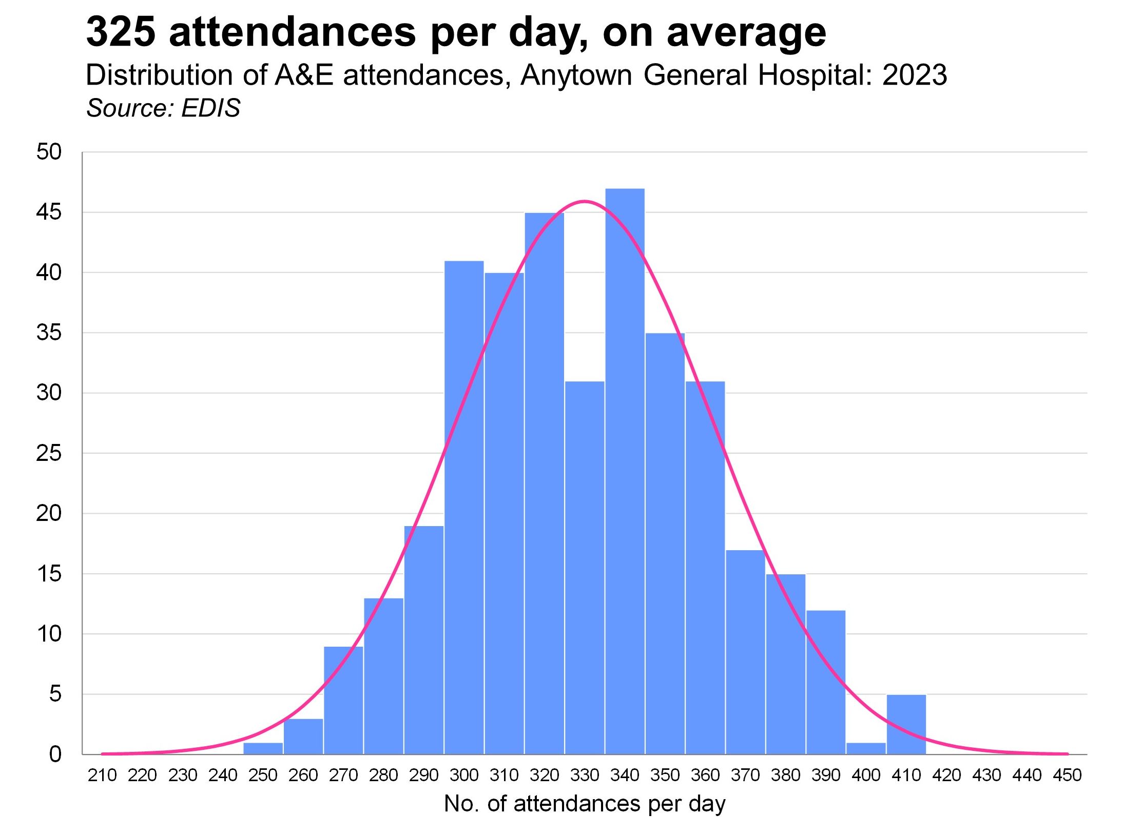
We start by drawing a histogram of some Normally distributed data. And then we overlay the 'theoretical' bell-shaped curve on top of that real data.
We then explore the concept of standard deviation (showing how to calculate it with the formula as well as by using Excel's =STDEV.S() function)/ We look at other ways of measuring and describing spread and dispersion in a dataset, and then we move onto other ways of visualizing distributions: box plots, population pyramids and cumulative frequency polygons. Finally, we show how quantiles can be supeimposed on histograms as vertical reference lines in order to enhance decision-makers' understanding of the data.
We deepen our understanding of quantiles in the second session by using them to visualize changes over time. It's often the case that when we want to show how a continuous variable has changed over time, we reach for the mean as our measure without really considering alternative measures. But it can often be helpful to show how selected quantiles (e.g. lower quartile, median, upper quartile) have changed. By plotting these metrics we often gain a cleaer picture of what's going on.
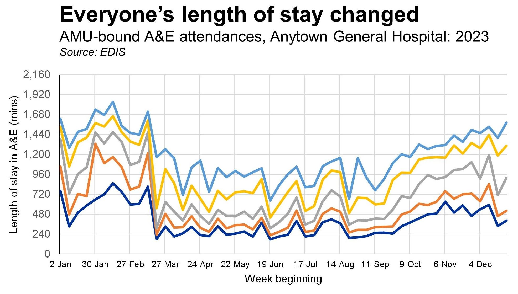
We also look in this session at ways of adapting Kaplan-Meier survival curves to show trend data. In addition, we experiment with other visualization techniques that describe elapsed time.
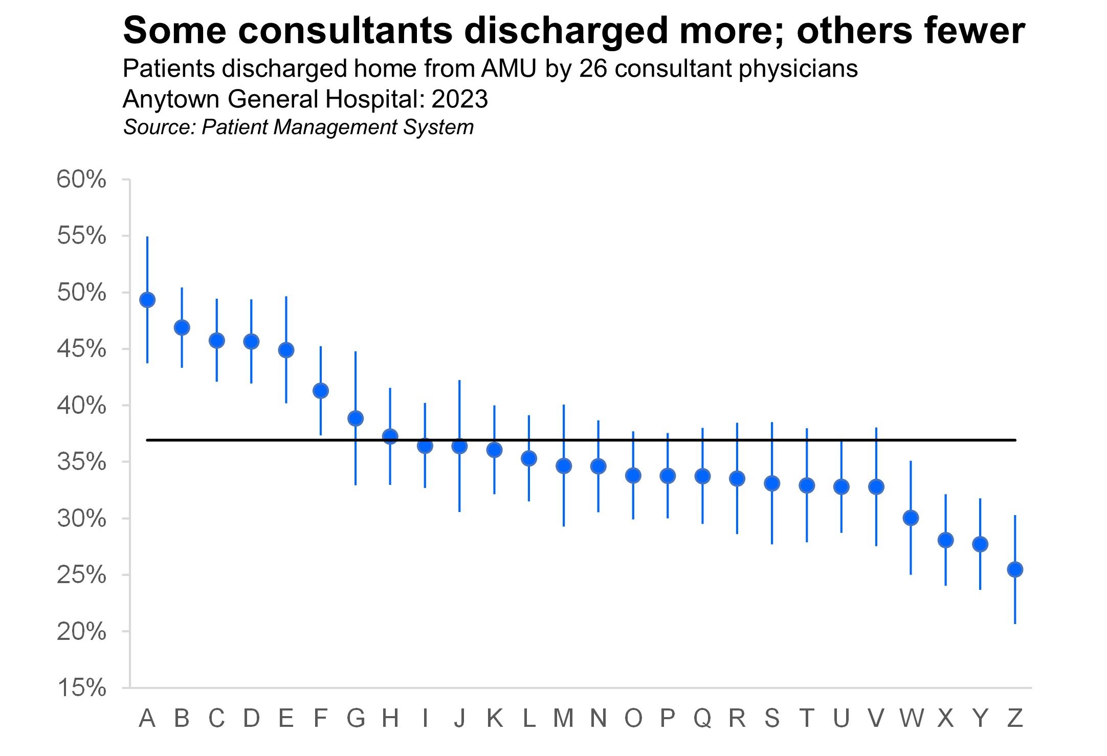
In the third session we get ourselves acquainted with standard error so that we can draw charts that show 95% confidence intervals. The one below shows - for 26 consultants working in an Acute Medical Unit - the percentage of patients discharged directly home (as opposed to being transferred downstream into the various specialty wards in the hospital).
We show how confidence intervals can be calculated for both parametric and non-parametric data. We discuss the issue of whether the underlying data has to be distributed Normally in order for parametric confidence intervals to work correctly, and we spend quite a bit of time on standard error and the Central Limit Thoeorem. A funnel plot example is also included in this session.
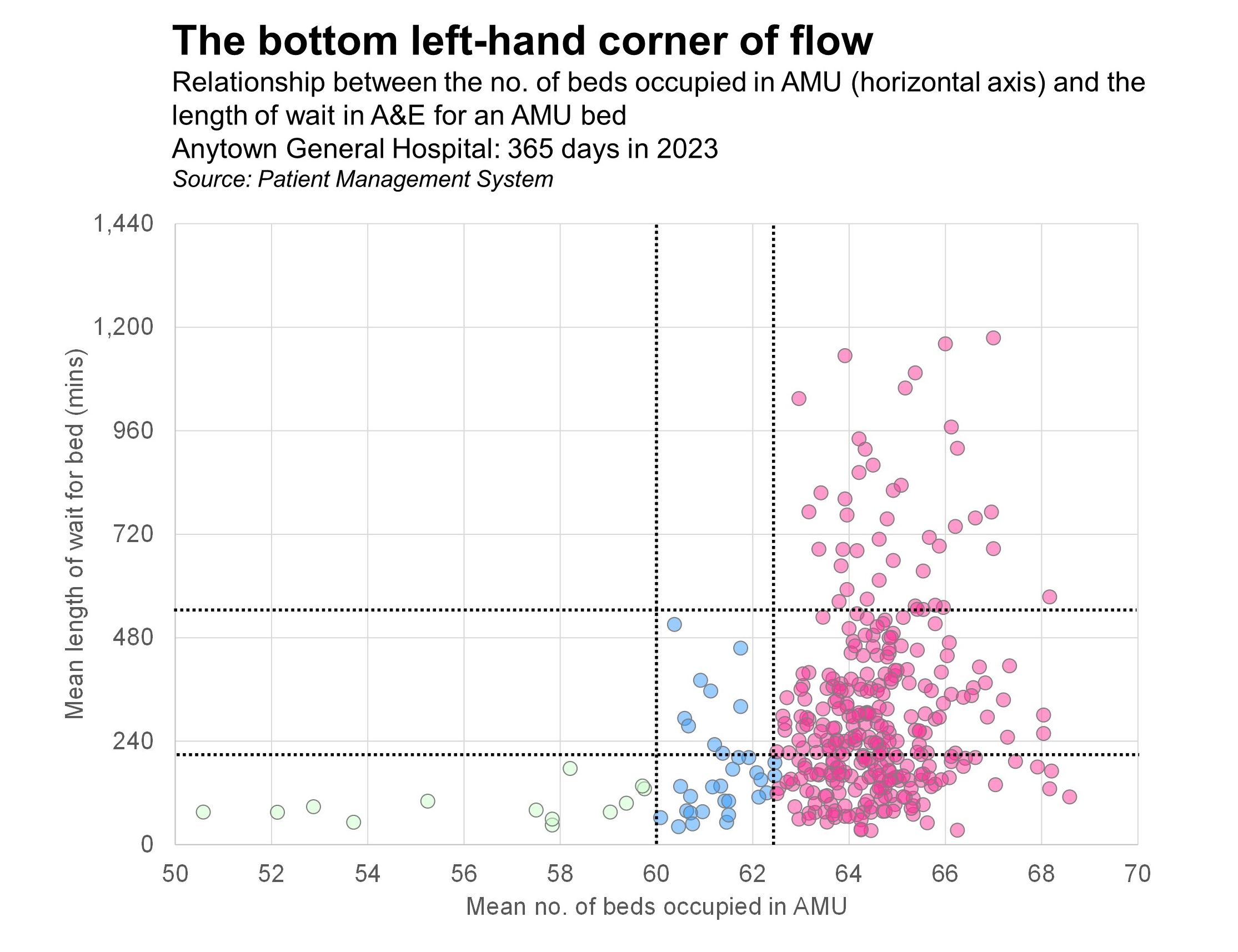
In the final session of the course we get to grips with scatterplots, bubble plots and correlation. Here's an example of a scatterplot that shows the relationship between how full a hospital's Acute Medical Unit was in 2023 (along the horizontal axis) and how long AMU-bound patients had to wait in A&E before being admitted to the AMU (on the vertical axis).
The course teaches the visualizations with a series of themed emergency care examples, so that the relevance of the techniques can be more easily grasped. This makes the course particularly relevant to analysts dealing with patient flow data, but the examples have been selected so that they are follow-able by people unfamiliar with the acute hospital environemnt. Every teaching example and exercise uses NHS data that's been used in real situations to shed light on real problems. This is not a course about statistical graphics for their own sake; it is about using visualization to make sense of real issues.
Visualizing Statistics can be delivered as either an on-site, in-person, face-to-face workshop OR as a virtual course via Microsoft Teams. In either case, the cost is £1,250+VAT, and up to 12 participants can be accommodated. Email info@kurtosis.co.uk to start making arrangements.