We don't just generate information for the sake of it; we generate it so that it can be used to make evidence-based decisions. But in order to do that effectively, we need to understand (a) the type of decision-making scenario we are in; and (b) how to align our data analysis and presentation plan with that scenario.
Using Data to Influence Business Decisions teaches these two things.
Session 1
09:30 to 11:00
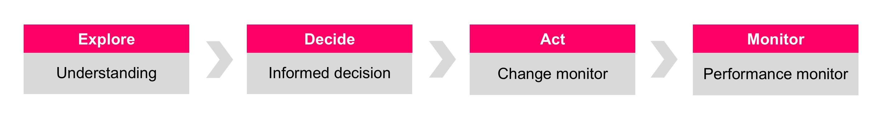
Four decision-making scenarios
The first session of the course introduces the four decision-making scenarios: explore, decide, act and monitor. We go through pre-prepared case study examples of data being analysed and presented in each scenario, before introducing the main case study which we use for the rest of the course.
Session 2
11:15 to 12:45
Explore scenarios
You know you're in an Explore scenario because it's the only scenario in which decision-makers are prepared to admit their ignorance! Their minds are open for data to reveal new insights. Yes, there may be some preconceptions, some pre-existing biases, but—in general—decision-makers in Explore scenarios are more amenable to being swayed by the data argument. So in the second session of the course we talk about the techniques you need to employ in order to move your audience from 'low understanding' to 'high understanding' by introducing them to a series of datagraphics.
Session 3
13:30 to 15:00
Decide scenarios
If Explore scenarios are often characterized by their informality, Decide scenarios are often more formal affairs: directorate meetings, committee meetings, board meetings. And their purpose is more focused: we often find ourselves presenting options in Decide scenarios. And we often find ourselves having to show the results of some 'what if' modelling.
Session 4
15:15 to 16:30
Act scenarios and Monitor scenarios
In the final session of the course we go through examples of how we'd present data when the questions we are trying to answer are "Did a change occur? And was it a 'real' change?" and "Is this indicator's trajectory stable, even though it appears to be varying quite a bit from point to point?"
Using Data to Influence Business Decisions can be booked as either an on-site face-to-face course or as a virtual course (via Microsoft Teams) for £1,250+VAT, and up to 12 participants can be accommodated in each workshop session. Email info@kurtosis.co.uk to start making arrangements.
A degree of familiarity with Microsoft Excel, Microsoft Word and Microsoft PowerPoint is needed for this training course.