Whenever we use data to describe the fullness of a ward (or a specialty or a hospital), we usually reach for an average bed occupancy figure. The trouble is, this average figure is hugely deficient. Bed fullness is too multi-faceted a phenomenon to describe using just one number. Let's see if we can find a better way to capture all the dimensions of bed fullness.
I looked at data in a medical specialty in a large general hospital. I used the 365 days of calendar year 2019, and for the whole of that period the specialty had 98 beds allocated to it. In three wards.
I first of all added up all the occupied bed days for the year: 37,896. Then I worked out the available bed days by taking the bed complement of 98 and multipying it by 365 to get 35,770. I then divided the second number by the first number and got 106%.

So far, so good. It shows that the specialty was—on average—overflowing. The trouble is, this number gives us no sense of the month-to-month, week-to-week or day-to-day variability. That one number of 106% is also a bit abstract, a bit nebulous. And it’s not at all 'visual'.
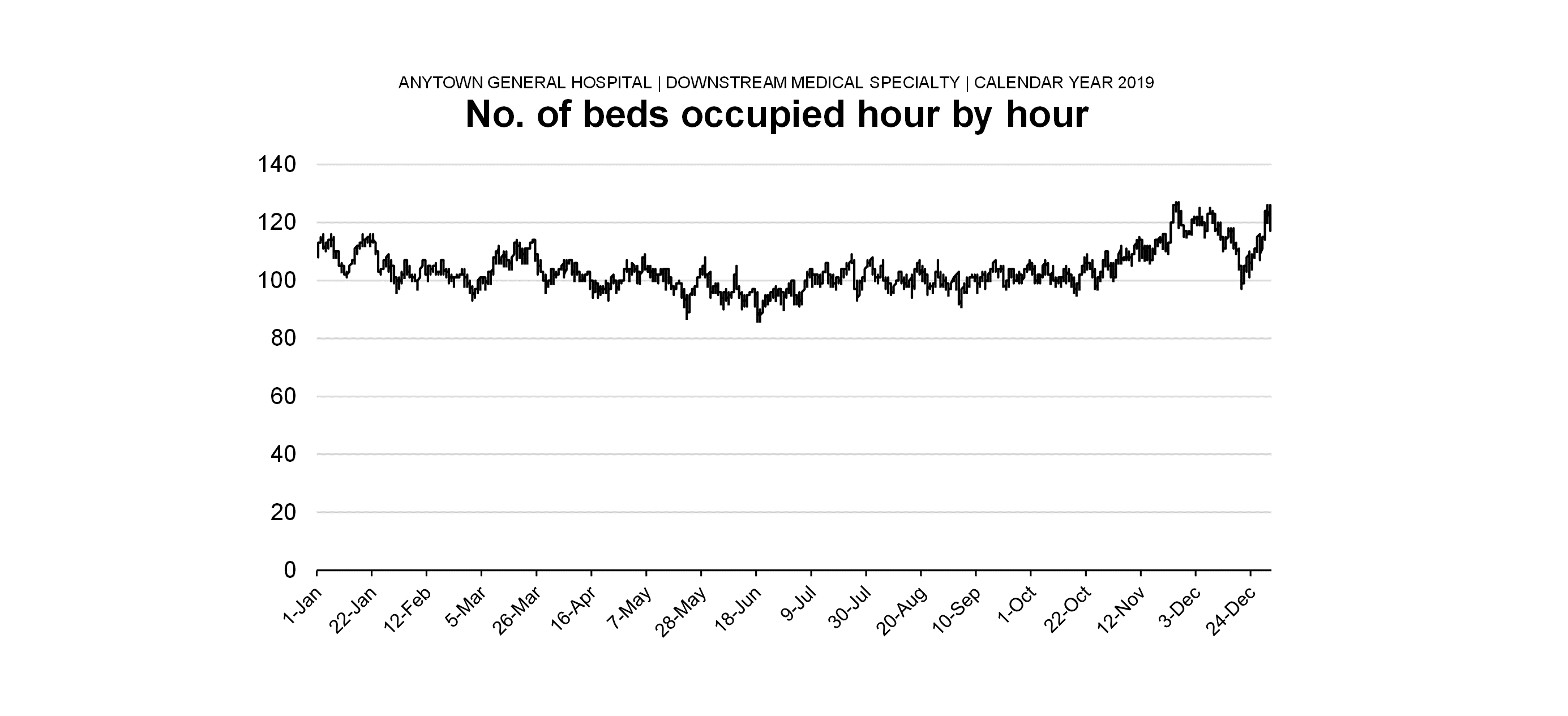
To try to remedy these shortcomings, I went back to the drawing-board and took retrospective hourly snapshots of the number of beds occupied by the specialty throughout the year. I reckoned that if I now drew a jagged line connecting all the 8,760 hourly-snapshot data points (8,760 is 365 days multiplied by 24 hours), I would address all of these shortcomings.

If a clinicians or manager is looking at this graph and they can recall from their recent memory the peaks and troughs of overflow, this jagged line should have a bit of resonance. Also, it's less abstract and more concrete than just the bald figure of 106%. Each measurement—each hourly snapshot—is something that you can see. But there's still a problem. I have a hunch that not all fullness is 'equal'. We're treating fullness here as if all patients are generating equal levels of fullness, regardless of how long they've been occupying the bed. But what if patients who've been in for a long time are more of a problem for patient flow than the patients who've only just arrived? Can I somehow incorporate the length of stay of the patients occupying beds into this graph?

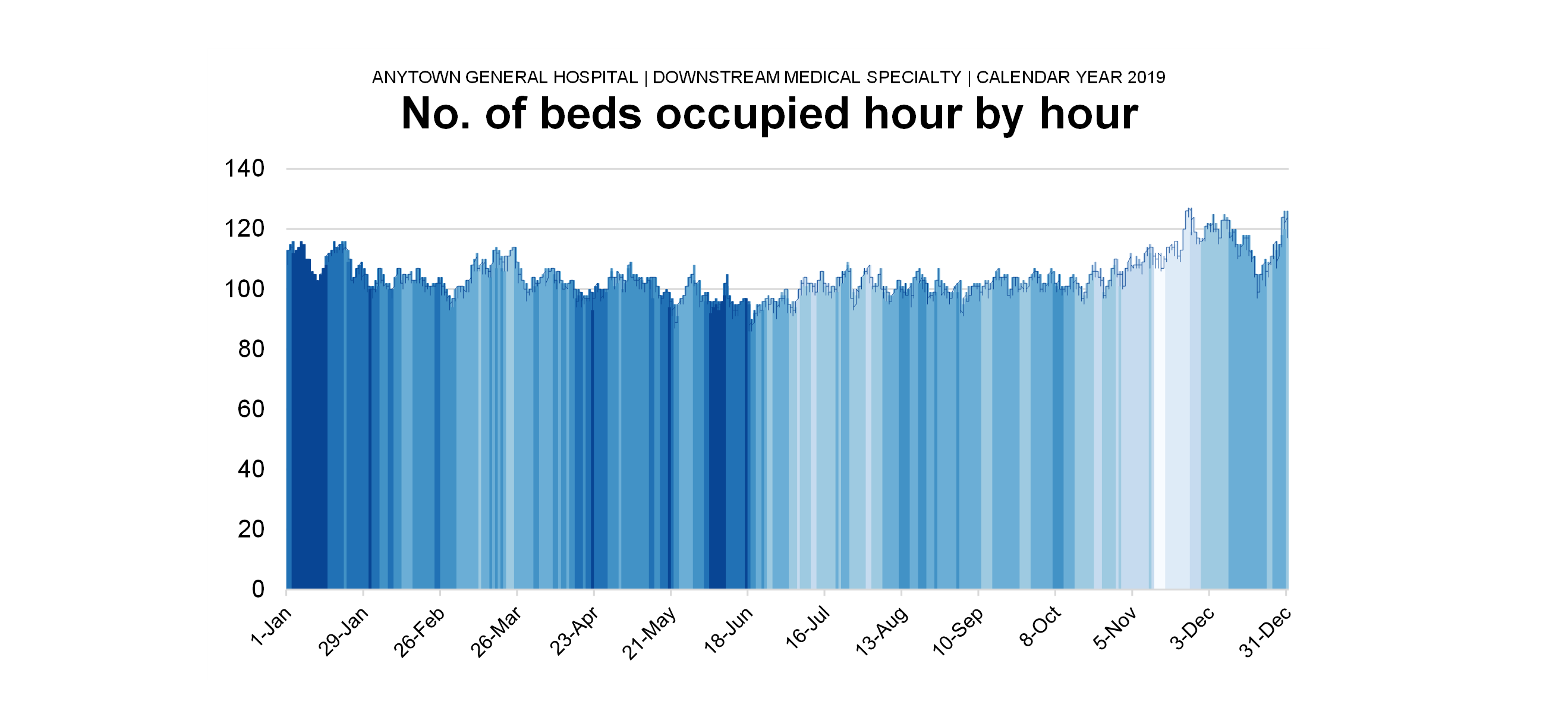
Here's my attempt. For each retrospective hourly fullness snapshot, I worked out the average length-of-stay-so-far (i.e. the length of stay from date and time of admission up to the date and time of the snapshot) and I calculated the average of those length-of-stay-so-far measurements for each snapsjhot. In this example they varied quite a lot: from 16 days to 31 days. I tried to imcorporate this not my existing jagged line diagram by representing the average length-of-stay-so-far as colour stripes. The darker the shade of blue, the longer the length-of-stay-so-far.
But there is yet another 'flavour' of fullness that I'm not showing yet. When patients overflow a specialty's bed allocation. they can get dispersed all over the hospital. And although our jagged line shows the amount of overflow, it doesn't show the extent of the overflow.
So I've tried to show the extent of the specialty's overflow by choosing one of the snapshots. The obvious one to pick was the one when the specialty was at its fullest, the date and time (26th November at 02:01, as it happens) when it was overflowing the most. I looked at which wards the 126 patients were being accommodated in and tried to represent that visually:

Yes, I know I need to incorporate the different shades of blue (I'm working on that - it needs a new scale!). And yes, I need to check what the official bed complements are for all the wards I've listed here. But as a way of showing dispersal I think it works.
And if we contrast the fullest day with the least full day, we can see what dispersal (or the lack of it) looks like:

FlowStories is an approach to patient flow that showcases data visualizations that help managers and clinicians understand the problem. There is an open workshop in central London scheduled for Friday 11th November 2022. More details on the FlowStories webpage.
[4 November 2022]
If you want to get notifications by email of new content on the Kurtosis website, please just contact info@kurtosis.co.uk and ask to be added to the email subscription list.