Here is Joe Bloggs' flow story.
He arrived at the Emergency Department (ED) at 14:37 on Sunday 10th February. He stayed there 198 minutes before being transferred to the Acute Medical Unit (AMU) at 17:55. He then spent 43 hours and seven minutes under the care of Acute Medicine before being transferred to one of the Medicine of the Elderly (MoE) wards at 12:43 on Tuesday 12th February, where he stayed for 23 days before being discharged home at 15:43 on Thursday 7th March.

When length of stay data like this is presented to managers and clinicians, it doesn't take long before the question is asked: "Can you identify how much of the stay was spent 'in delay'?". This question isn't asked so that someone can be 'blamed' for a length of stay that's 'too long'; instead, it's asked so that the clinicians can get a clearer sense of the length of stay that was under their control. If you look at this from the perspective of a geriatrician, you can see why they might want the Medicine of the Elderly portion of the patient journey to be split along the following lines:

(It's worth mentioning at this point that measuring and describing delays is rarely a straightforward black-and-white thing. You often find that multiple delyas have ben recorded for the same stay, with periods of 'non-delay' interspersed between the delays. My own preference is to use the latest delay recorded and use that as the 'default' delay unless I'm specifically asked to do otherwise.)
Delay detail is often asked for at the Emergency Department staging post, too. It's fairly commonplace for EDs to record the time a patient was ready to be admitted to a ward (as opposed to the time they actually got admitted to that ward) and we can use this data field to identify 'wait for bed' delays. Here is Joe Bloggs' visual flow story updated to include the orange ED > AMU 'wait for bed' delay:

That leaves the delay in AMU. To cpmplete the shading in this visual flow story I want to know how much of the light green AMU stay needs to be shaded dark green. For how long was Joe Bloggs occupying a bed in AMU while waiting for a downstream specialty bed to become available?
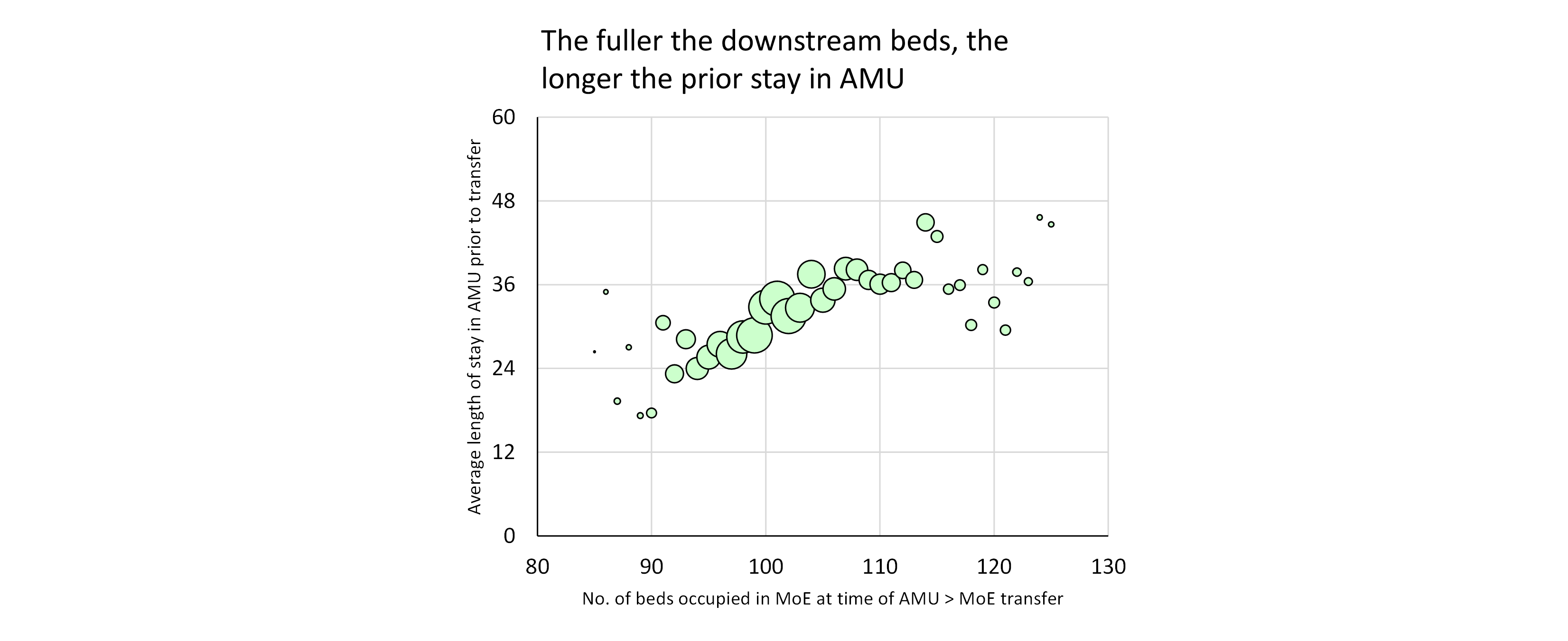
We know that these delays exist. But in my experience the AMU > downstream bed delays are not routinely recorded or described. Which—if my experience is representative—is strange, because the exit block faced by AMUs is just as big a problem for the unscheduled care whole system as the exit block faced by EDs. Here—by way of illustration—is a bubble plot that shows the relationship between the fullness of the MoE beds (on the horizontal axis) and the prior length of stay (measured in hours along the vertical axis) in AMU of the patients who ended up in those MoE beds:

So the middle—AMU—portion of Joe Bloggs' flow story will have to do without any dark green shading, even though there probably was a delay. At the time of his transfer (12:43 on Thursday 12th February), Medicine of the Elderly was already overflowing its bed allocation by five beds, so it's not as if there was an empty bed just waiting for him to be moved into.

(The Joe Bloggs example is based on real life but everything—names, dates, specialty names—has been changed.)
[27 May 2022]