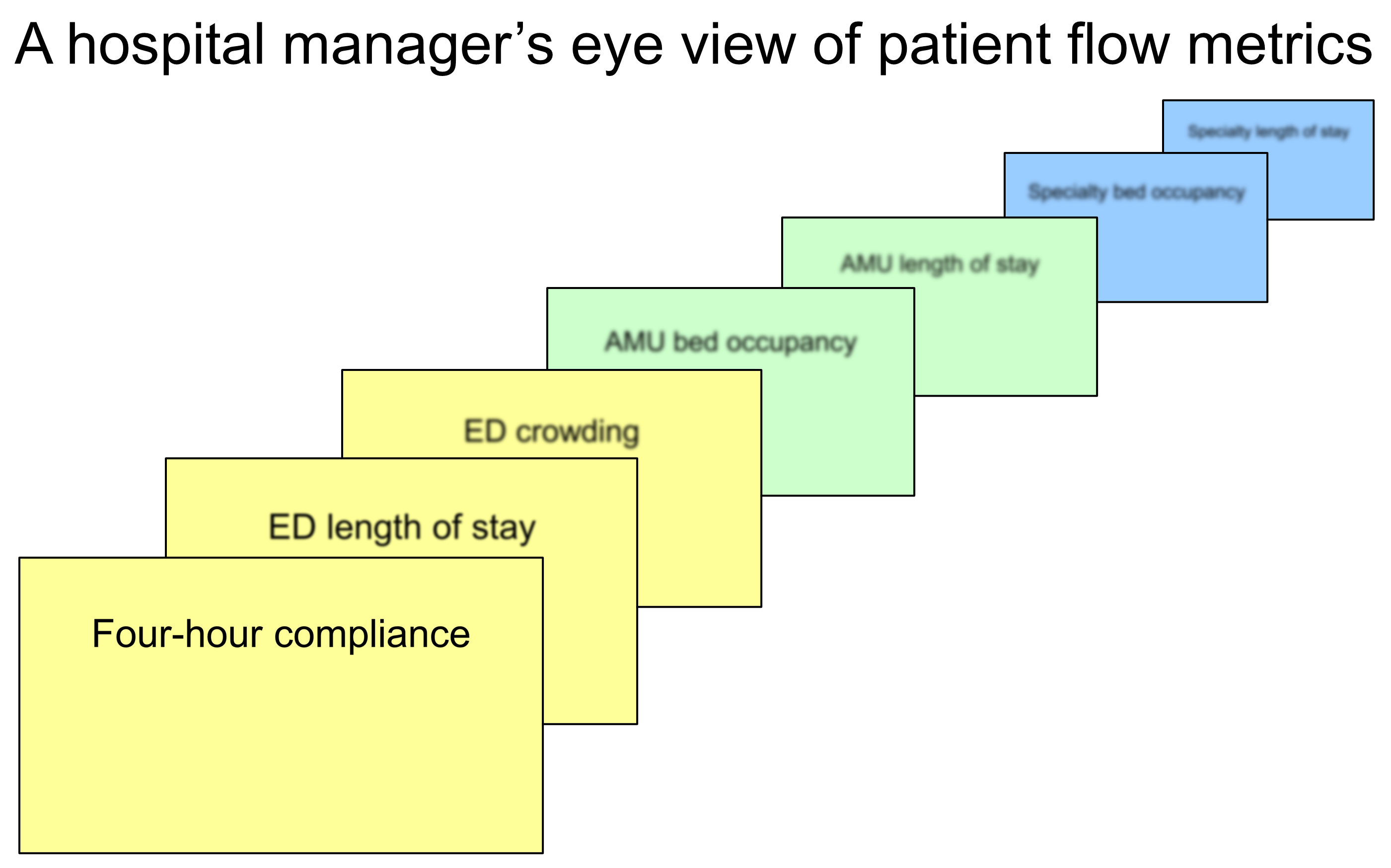

I posted this image on X last week, fully expecting to be shot down in flames:

But nobody disagreed with the sentiment that when hospital managers use data to address the patient flow problem, the only indicator they get a proper, focused view of is a front door metric. They might be dimly aware that other—downstream—metrics also matter, but those metrics—if they exist at all—are too distant to see, too blurred to read.
There were a couple of suggestions. One person commented saying the diagram was missing a massive square in front of everything labelled "elective activity". Another thought there weren't enough front door metrics so suggested more: 12-HOUR AND 24-HOUR STAYS IN THE ED. NO. DISCHARGED WITHIN 4 HOURS. NO. ADMITTED WITHIN FOUR HOURS. There was another comment to the effect that maybe this wasn't just the hospital manager's eye view, that this is maybe how everybody sees the problem.
Those distant metrics need to be brought closer. They need to be in focus. They need to be given the same weight, the same attention as the front door metrics.
[27 August 2025]
[This originally appeared as a thread on X.]