Alfonso d'Albuquerque was the first Portuguese governor in India, and in 1514 as part of his diplomatic dealings with the sultan of Gujarat, he was given the gift of a live rhinoceros, which he succeeded in shipping to Portugal aboard a trading vessel. The voyage lasted 120 days, and when the rhino disembarked in Lisbon on 20th May 1515 it caused quite a stir.
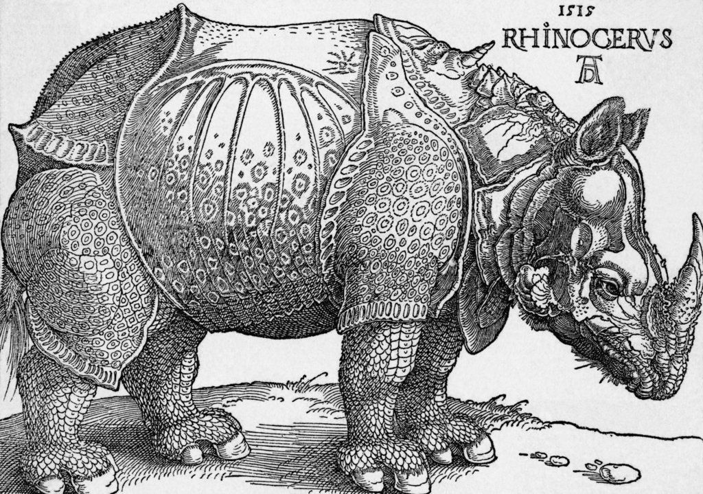
Nobody in Europe had ever seen a rhinoceros, so it was an exotic, exciting thing for people to look at. Word spread across the continent about the beast. One written account reached the artist Albrecht Dürer in Nuremberg, who felt inspired to create his own depiction. The drawing he produced became famous in Dürer's own lifetime, and even more famous in the years and centuries following his death.
I am in awe of Dürer's audacity. He made the decision to draw the rhinoceros even though he hadn't seen it. He'd merely seen a written account of what it looked like, and he'd also seen someone else's sketch. But Dürer himself had never seen a rhinoceros.
And this story of how Albrecht Dürer came to draw an animal he'd never seen, this idea of creating a version of reality without ever having actually witnessed that reality first hand, it made me wonder if this is a feature of data analyst life in the NHS. Isn't that what we do most of the time? Aren't we busy creating visual representations of a reality that we've never actually seen? Sometimes we have no choice, it can be extremely dfficult and time-consuming to see what healthcare looks like in all its manifestations, but I'm pretty sure we don't do everything in our power to try to see the world as doctors see it, as nurses see it, as managers see it, as patients see it. And as a result we probably make mistakes with our visual representations, a bit like Dürer did with his rhino. So although he got most of it right, there were some important elements that he got wrong: for example, the horn on its back that shouldn't be there, and the fact that the whole animal looks as if it's wearing an actual suit of armour.
There's something else about this story. I like how Dürer didn't just draw or paint the rhino; he made prints of the rhino. Part of this decision was doubtless a commercial, entrepreneurship thing. He had to make money, he had to feed his family. But it's also a technology thing. Dürer isn't just an artist; he's also a master of printmaking, which in the beginning of the 16th Century is a new technology, so part of his decision to make prints of the rhino is because he can. Printing is a technology that enables him to publish widely, even though he hasn't checked that his work is accurate or meaningful first. And this part of the story made me wonder if information analysts are—like Dürer—guilty of publishing our content widely before we've ensured that it's a faithful rendition of whatever it is we're describing. It's a bit like we've got this urge to create online data dashboards straightaway. We often don't bother with the rough sketch that we should be sharing with our client, allowing them to edit it, make suggestions, co-create it with us, drafting and re-drafting several times until we get it right, and only then publishing it more widely. No,I worry that too often there is this 'rush to publish': get it out there as soon as possible.
Anyway, the thing is that Dürer's rhinoceros—for all of its inaccuaracies and faults—became the orthodoxy for what rhinos looked like that persisted long after Dürer's death. This print was used in Zoology textbooks until well into the eighteenth century. Even after European people started to see rhinos and discovered that they didn't have horns on their backs, this print was still being used and looked at and admired. The ultimately-inaccurate orthodoxy that had been established in 1515 proved surprisingly durable.
I think this is an example of what designers call 'heuristic bias'. Once an orthodoxy has been established, it is—like a habit—hard to break. So we easily and naturally use it and refer to it, even though it might be wrong. So if we've found a convenient way of depicting healthcare reality using tables and graphs then we'll just keep re-deploying that method even though those tables and graphs might not actually be the best way of representing it, and might even be just plain wrong.
So anyway, what about the rhino? What happened to it after it had landed in Portugal? Well, after a while, the King of Portugal decided he wanted to make a gift of it to the Pope. It was loaded into another boat, and it began another voyage, this time across the Mediterranean. But there was a storm, the ship sank and the rhino perished. Any chance it might have had of swimming safely to shore (rhinos are strong swimmers, apparently) was nullified by the fact that it had been tied down to the deck. That's a bit of the story that's also ripe for metaphor, but I'll leave that for another time.
[15 November 2018]