Statistical process control (SPC) is a method of data analysis and presentation that has steadily gained acceptance in the NHS over the last ten years or so. And there are software packages that make it easy to create run charts and control charts 'automatically' from raw data.
But one of the barriers that prevent us from making the most of SPC is that managers and clinicians often don't fully understand the charts, and analysts often can't explain the charts to them. The result is that SPC then loses credibility, despite its undoubted importance as a tool for improving and monitoring health service processes.
Health Service SPC is a one-day course that shows analysts (and Excel-literate managers) how to create run charts and control charts from scratch using raw data, how to decide which control chart is the most appropriate for the given scenario, how to understand the interpretation rules and how to explain the finished data exhibit to NHS audiences.
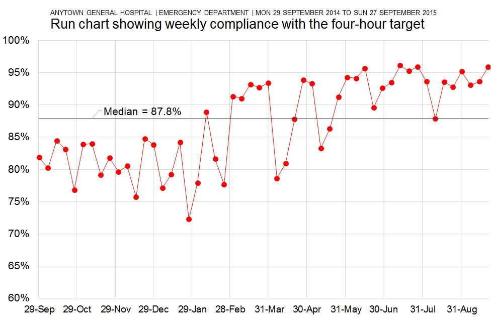
Session 1 / Run Charts
The first session of the course teaches how to draw, understand and explain run charts. We compare datasets to see if our run charts can detect special cause variation. We make sure we have a profound understanding of the 'rules' governing how we interpret run charts, and we rehearse various scenarios when we might be called upon to explain the charts to an NHS meeting.
Session 2 / Control Charts (1): XmR charts
The second session focuses on the most commonly used control chart: the XmR chart. We create several XmR charts in our attempts to understand some of the system changes we detected in the first session of the course. And we make sure we understand why XmR charts are chosen as our control charts of choice as opposed to other types of control chart.
Session 3 / Control Charts (2): x-bar and s charts
When the observations we plot on our control charts are themselves averages (so that we are creating a time series made up of consecutive average values), we need to be aware of how an x-bar and s chart can add to our understanding. We create several examples of x-bar and s charts as we continue to explore how the hospital's emergency care system performs over time.
Session 4 / Control charts (3): p charts, funnel plots, c-charts and u-charts
The final session of the course concentrates on control charts for proportions, percentages and counts. As with the previous sections of the course, we don't just show how to calculate the control limits and draw the charts in Excel; we also ensure that we understand and are able to explain the charts in layperson terms to others.
Health Service SPC uses NHS data as the basis for its teaching examples and exercises. We use emergency care data throughout, weaving a narrative through the day as we use SPC to explore the reasons why a hospital's emergency care system is dysfunctional, and to understand how it then markedly improves its patient flow performance. As a result, this course is particularly well-suited to analysts and managers who work in hospital unscheduled care environments. But it will also appeal to staff in other environments who are prepared to think more carefully about how to translate the course examples into their own day-to-day work situations.
Health Service SPC can be booked as an on-site workshop for £1,250+VAT, and up to 12 participants can be accommodated in each workshop session. Email info@kurtosis.co.uk to start making arrangements.
A degree of familiarity with Microsoft Excel is needed for this training course.