A one day training course for NHS data analysts who already have a very basic familiarity with R. We assume that you've used the key functions in {dplyr} and that you've created some simple charts in {ggplot2} but you now want to develop your R skills that little bit more.
The course covers its material by means of four case studies, one for each of the four 90-minute sessions. In each session we use the {dplyr} package to explore, analyse and summarize the data, and the {ggplot2} package to create visualizations of the summarized data.
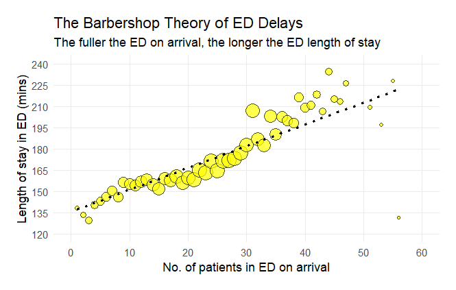
Session 1 / The Barbershop Theory of ED Delays
The first session of the course shows how to take a year's worth of Emergency Department attendances and identify - for each time thata patient arrived - the ED fullness level and the eventual length of ED stay of the patient that arrived at that moment. We use a non-equi left_join() to do this. We draw the bubbleplot using geom_point() and geom_smooth().
Session 2 / Minute-by-minute changes in Emergency Department fullness
In the second session, we start by importing data from a URL, which necessitates a few additional wrangling tweaks in order to ensure that the dates and times work OK. The data-wrangling involves creating a dataframe of datetimes from scratch, plus some more practice with non-equi joins. The finished graph makes use of {ggpattern}'s geom_area_pattern() function to create a gradient fill.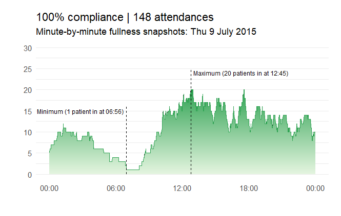
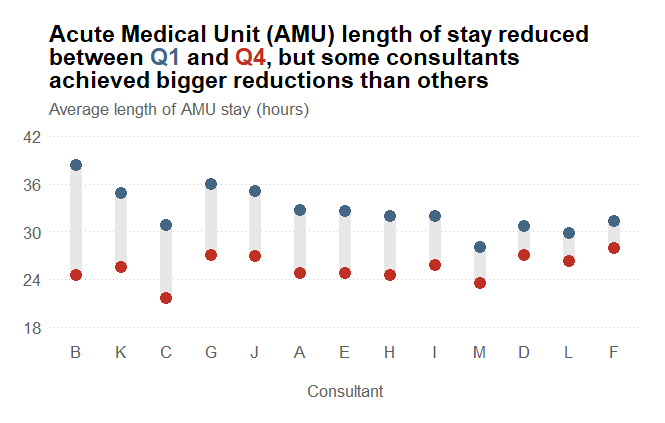
Session 3 / A dumbbell chart comparing changes in AMU length of stay
In the third session we use a dataset containing Acute Medical Unit (AMU) data. We wrangle the data, doing some filtering before creating a summary table that shows the average lengths of stay of 13 consultants in quarter 1 and quarter 2. We then draw a dumbbell plot to illustrate these changes.
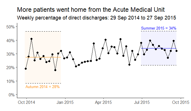
Session 4 / A control chart to highlight a process change
The final session looks at data on the percentage of patients discharged home from an AMU, and how that percenatge changed over a 52-week period. We then calculate control limits for the first quarter and the final quarter and include them on the finished {ggplot2} chart.
The course has been designed to be delivered either conventionally (in-person face-to-face) or virtually (via Microsoft Teams). However we do it, each participant will need their own laptop (and a POSIT Cloud identity - I provide instructions for how to do this well in advance of the course) and we all work through the case studies together.
R from First to Second Gear can be booked as either an on-site face-to-face course or as a virtual course (via Microsoft Teams) for £1,250+VAT, and up to 12 participants can be accommodated in each workshop session. Email info@kurtosis.co.uk to start making arrangements.
A small amount of experience of R is needed for this training course.