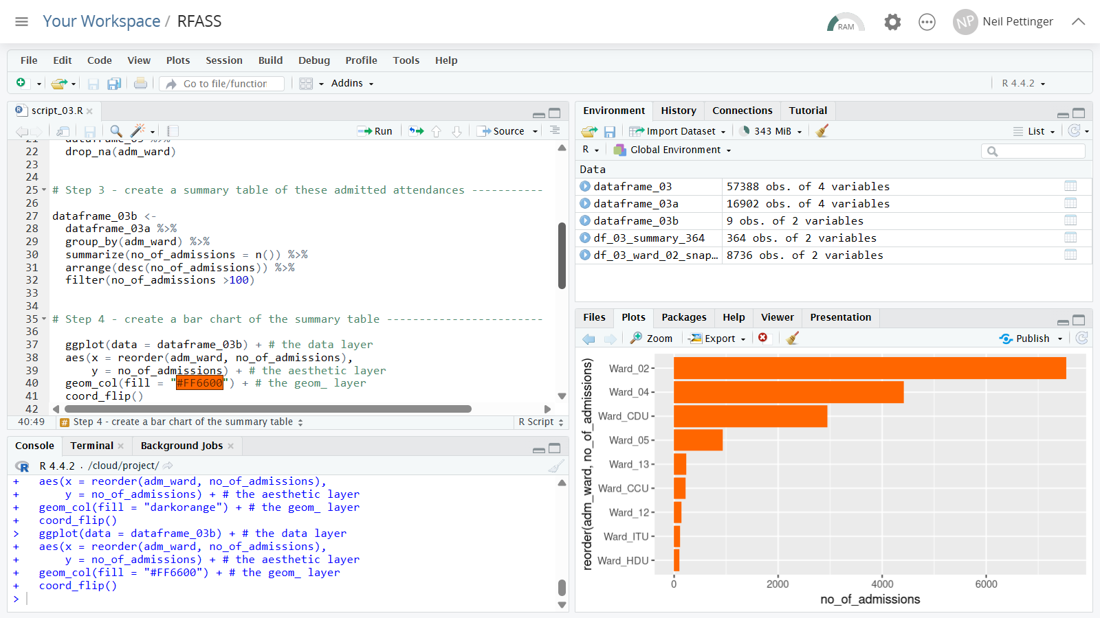
This is a one-day training course for NHS data analysts who are completely new to R. The course assumes that you know nothing about R and want to learn enough R very quickly to see how it might help you with your data analysis and visualization work.

The course is divided into four 90-minute sessions. We take a {tidyverse} approach to R, so in each session we begin by using functions from the {dplyr} package to tidy, analyse and summarize the data, and we then move on to use the {ggplot2} package so that we can create visualizations of the data. The exercises start simple, and then gradually build up in complexity as we go through the course. Your repertoire of functions and arguments builds quickly by doing useful things with R using real healthcare data.
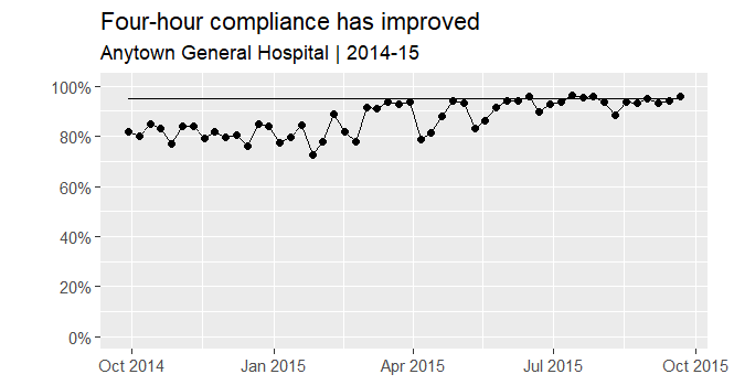
Session 1 / Create a line chart that shows the week-by-week trajectory of four-hour compliance over a 52-week period
The first session of the course shows how to do a basic import of one worksheet from an .xlsx file. We then apply several of the five core functions of {dplyr} to the imported dataframe. We quickly get to the group_by() and summarize() functions, which we use to create a summary table. We then take this summary table and use geom_line() from the ggplot2 package to draw a graph that shows how four-hour compliance improved over a 52-week period:
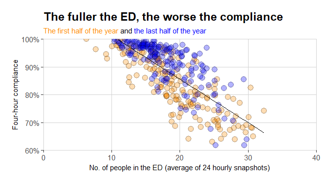
Session 2 / Create a scatterplot that shows the relationship between ED fullness and four-hour compliance
The second session introduces new functions. The data import is still of an .xlsx file but this time it contains multiple worksheets. The {dplyr} functions get more of a workout, with the left_join() function being brought into service to bring the daily fullness snapshots and the daily four-hour compliance values together in the same dataframe. The chart we draw is a scatterplot showing the relationship between ED fullness and ED four-hour performance:
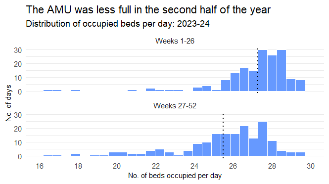
Session 3 / Create a facet grid of two histograms
In the third session we use {dplyr}'s case_when() function and then explore {ggplot2}'s geom_histogram() and facet_wrap() functionality to draw two histograms - one on top of the other - that allow us to see an Acute Medical Unit's bed occupancy in both the first half of the year and the second half of the year:
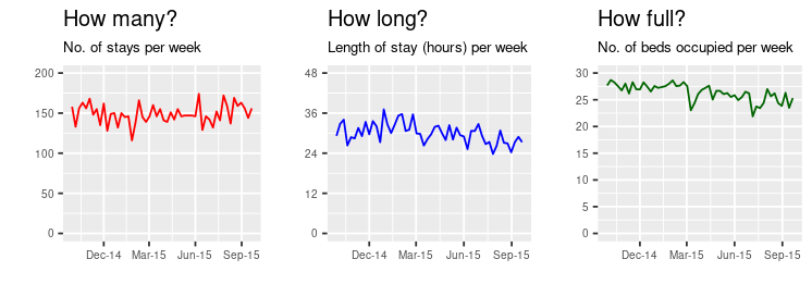
Session 4 / Draw three line charts side by side
The final session builds on the skills learned and practiced in the earlier three sessions (for example, we introduce if_else() within summarize() to help us create more meaningful summary tables) to create three line charts side-by-side using the {cowplot} package:
The course has been designed to be delivered either conventionally (in-person face-to-face) or virtually (via Microsoft Teams). However we do it, each participant will need their own laptop (and a POSIT Cloud identity - I provide instructions for how to do this well in advance of the course) and we all work through the case studies together.
R from a Standing Start can be booked as either an on-site face-to-face course or as a virtual course (via Microsoft Teams) for £1,250+VAT, and up to 12 participants can be accommodated in each workshop session. Email info@kurtosis.co.uk to start making arrangements.
No experience of R is needed for this training course.